Situation Normal
I recently bought an electronic kitchen scale. It has a glass platform and an Easy To Read Blue Backlit Display. My purchase was not symptomatic of a desire to bake elaborate desserts. Nor was I intending my flat to become the stash house for local drug gangs. I was simply interested in weighing stuff. As soon as the scale was out of its box I went to my local bakers, Greggs, and bought a baguette. It weighed 391g. The following day I returned to Greggs and bought another baguette. This one was slightly heftier at 398g. Greggs is a chain with more than a thousand shops in the UK. It specializes in cups of tea, sausage rolls and buns plastered in icing sugar. But I had eyes only for the baguettes. On the third day the baguette weighed 399g. By now I was bored with eating a whole baguette every day, but I continued with my daily weighing routine. The fourth baguette was a whopping 403g. I thought maybe I should hang it on the wall, like some kind of prize fish. Surely, I thought, the weights would not rise for ever, and I was correct. The fifth loaf was a minnow, only 384g.
In the sixteenth and seventeenth centuries Western Europe fell in love with collecting data. Measuring tools, such as the thermometer, the barometer and the perambulator – a wheel for clocking distances along a road – were all invented during this period, and using them was an exciting novelty. The fact that Arabic numerals, which provided effective notation for the results, were finally in common use among the educated classes helped. Collecting numbers was the height of modernity, and it was no passing fad; the craze marked the beginning of modern science. The ability to describe the world in quantitative, rather than qualitative, terms totally changed our relationship with our own surroundings. Numbers gave us a language for scientific investigation and with that came a new confidence that we could have a deeper understanding of how things really are.
I was finding my daily ritual of buying and weighing bread every morning surprisingly pleasurable. I would return from Greggs with a skip in my step, eager to see just how many grams my baguette would be. The frisson of expectation was the same as the feeling when you checkggs otball scores or the financial markets – it is genuinely exciting to discover how your team has done or how your stocks have performed. And so it was with my baguettes.
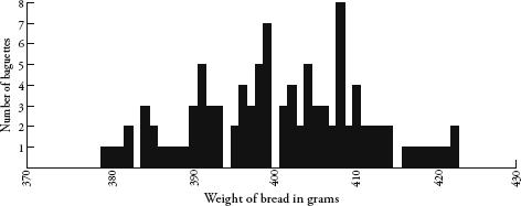
The motivation behind my daily trip to the bakers was to chart a table of how the weights were distributed, and after ten baguettes I could see that the lowest weight was 380g, the highest was 410g, and one of the weights, 403g, was repeated. The spread was quite wide, I thought. The baguettes were all from the same shop, cost the same amount, and yet the heaviest one was almost 8 percent heavier than the lightest one.
I carried on with my experiment. Uneaten bread piled up in my kitchen. After a month or so, I made friends with Ahmed, the Somali manager of Greggs. He thanked me for enabling him to increase his daily stock of baguettes, and as a gift gave me a pain au chocolat.
It was fascinating to watch how the weights spread themselves along the table. Although I could not predict how much any one baguette would weigh, when taken collectively a pattern was definitely emerging. After 100 baguettes, I stopped the experiment, by which time every number between 379g and 422g had been covered at least once, with only four exceptions:
I had embarked on the bread project for mathematical reasons, yet I noticed interesting psychological side-effects. Just before weighing each loaf, I would look at it and ponder the colour, length, girth and texture – which varied quite considerably between days. I began to consider myself a connoisseur of baguettes, and would say to myself with the authority of a champion boulanger, ‘Now, this is a heavy one’ or ‘Definitely an average loaf today’. I was wrong as often as I was right. Yet my poor forecasting record did not diminish my belief that I was indeed an expert in baguette-assessing. It was, I reasoned, the same self-delusion displayed by sports and financial pundits who are equally unable to predict random events, and yet build careers out of it.
Perhaps the most disconcerting emotional reaction I was having to Greggs’ baguettes was what happened when the weights were either extremely heavy or extremely light. On the rare occasions when I weighed a record high or a record low I was thrilled. The weight was extra special, which made the day seem extra special, as if the exceptionalness of the baguette would somehow be transferred to other aspects of my life. Rationally, I knew that it was inevitable that some baguettes would be oversized and some under-sized. Still, the occurrence of an extreme weight gave me a high. It was alarming how easily my mood could be influenced by a stick of bread. I consider myself unsuperstitious and yet I was unable to avoid seeing meaning in random patterns. It was a powerful reminder of how susceptible we all are to unfounded beliefs.
Despite the promise of certainty that numbers provided the scientists of the Enlightenment, they were often not as certain as all that. Sometimes when the same thing was measured twice, it gave two different results. This was an awkward inconvenience for scientists aiming to find clear and direct explanations for natural phenomena. Galileo Galilei, for instance, noticed that when calculating distances of stars with his telescope, his results were prone to variation; and the variation was not due to a mistake in his calculations. Rather, it was because measuring was intrinsically fuzzy. Numbers were not as precise as they had hoped.
This was exactly what I was experiencing with my baguettes. There were probably many factors that contributed to the variance in weight – the amount and consistency of the flour used, the length of time in the oven, the journey of the baguettes from Greggs’ central bakery to my local store, the humidity of the air and so on. Likewise, there were many variables affecting the results from Galileo’s telescope – such as atmospheric conditions, the temperature of the equipment and personal details, like how tired Galileo was when he recorded the readings.
Still, Galileo was able to see that the variation in his results obeyed certain rules. Despite variation, data for each measurement tended to cluster around a central value, and small errors from this central value were more common than large errors. He also noticed that the spread was symmetrical too – a measurement was as likely to be less than the central value as it was to be more than the central value.
Likewise, my baguette data showed weights that were clustered around a value of about 400g, give or take 20g on either side. Even though none of my hundred baguettes weighed precisely 400g, there were a lot more baguettes weighing around 400g than there were ones weighing around 380g or 420g. The spread seemed pretty symmetrical too.
The first person to recognize the pattern produced by this kind of measurement error was the German mathematician Carl Friedrich Gauss. The pattern is described by the following curve, called the bell curve:
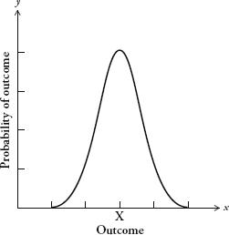
Gauss’s graph needs some explaining. The horizontal axis describes a set of outcomes, for instance the weight of baguettes or the distance of stars. The vertical axis is the probability of those outcomes. A curve plotted on a graph with these parameters is known as a distribution. It shows us the spread of outcomes and how likely each is.
There are lots of different types of distribution, but the most basic type is described by the curve opposite. The bell curve is also known as the normal distribution, or the Gaussian distribution. Originally, it was known as the curve of error, although because of its distinctive shape, the term bell curve has become much more common. The bell curve has an average value, which I have marked X, called the mean. The mean is the most likely outcome. The further you go from the mean, the less likely the outcome will be.
When you take two measurements of the same thing and the process has been subject to random error you tend not to get the same result. Yet the more measurements you take, the more the distribution of outcomes begins to look like the bell curve. The outcomes cluster symmetrically around a mean value. Of course, a graph of measurements won’t give you a continuous curve – it will give you (as we saw with my baguettes) a jagged landscape of fixed amounts. The bell curve is a theoretical ideal of the pattern produced by random error. The more data we have, the closer the jagged landscape of outcomes will fit the curve.
In the late nineteenth century the French mathematician Henri Poincaré knew that the distribution of an outcome that is subject to random measurement error will approximate the bell curve. Poincaré, in fact, conducted the same experiment with baguettes as I did, but for a different reason. He suspected that his local boulangerie was rpping him off by selling underweight loaves, so he decided to exercise mathematics in the interest of justice. Every day for a year he weighed his daily lkg loaf. Poincaré knew that if the weight was less than 1kg a few times, this was not evidence of malpractice, since one would expect the weight to vary above and below the specified 1kg. And he conjectured that the graph of bread weights would resemble a normal distribution – since the errors in making the bread, such as how much flour is used and how long the loaf is baked for, are random.
After a year he looked at all the data he had collected. Sure enough, the distribution of weights approximated the bell curve. The peak of the curve, however, was at 950g. In other words, the average weight was 0.95kg, not 1kg as advertised. Poincaré’s suspicions were confirmed. The eminent scientist was being diddled, by an average of 50g per loaf. According to popular legend, Poincaré alerted the Parisian authorities and the baker was given a stern warning.
After his small victory for consumer rights, Poincaré did not let it lie. He continued to measure his daily loaf, and after the second year he saw that the shape of the graph was not a proper bell curve; rather, it was skewed to the right. Since he knew that total randomness of error produces the bell curve, he deduced that some non-random event was affecting the loaves he was being sold. Poincaré concluded that the baker hadn’t stopped his cheapskate, underbaking ways but instead was giving him the largest loaf at hand, thus introducing bias in the distribution. Unfortunately for the boulanger, his customer was the cleverest man in France. Again, Poincaré informed the police.
Poincaré’s method of baker-baiting was prescient; it is now the theoretical basis of consumer protection. When shops sell products at specified weights, the product does not legally have to be that exact weight – it cannot be, since the process of manufacture will inevitably make some items a little heavier and some a little lighter. One of the jobs of trading-standards officers is to take random samples of products on sale and draw up graphs of their weight. For any product they measure, the distribution of weights must fall within a bell curve centred on the advertised mean.
Half a century before Poincaré saw the bell curve in bread, another mathematician was seeing it wherever he looked. Adolphe Quételet has good claim to being the world’s most influential Belgian. (The fact that this is not a competitive field in no way diminishes his achievements.) A geometer and astronomer by training, he soon became sidetracked by a fascination with data – more specifically, with finding patterns in figures. In one of his early projects, Quételet examined French national crime statistics, which the government started publishing in 1825. Quételet noticed that the number of murders was pretty constant every year. Even the proportion of different types of murder weapon – whether it was perpetrated by a gun, a sword, a knife, a fist, and so on – stayed roughly the same. Nowadays this observation is unremarkable – indeed, the way we run our public institutions relies on an appreciation of, for example, crime rates, exam pass rates and accident rates, which we expect to be comparable every year. Yet Quételet was the first person to notice the quite amazing regularity of social phenomena when populations are taken as a whole. In any one year it was impossible to tell who might become a murderer. Yet in any one year it was possible to predict fairly accurately how many murders would occur. Quételet was troubled by the deep questions about personal esponsibility this pattern raised and, by extension, about the ethics of punishment. If society was like a machine that produced a regular number of murderers, didn’t this indicate that murder was the fault of society and not the individual?
Quételet’s ideas transformed the use of the word statistics, whose original meaning had little to do with numbers. The word was used to describe general facts about the state; as in the type of information required by statesmen. Quételet turned statistics into a much wider discipline, one that was less about statecraft and more about the mathematics of collective behaviour. He could not have done this without advances in probability theory, which provided techniques to analyse the randomness in data. In Brussels in 1853 Quételet hosted the first international conference on statistics.
Quételet’s insights on collective behaviour reverberated in other sciences. If by looking at data from human populations you could detect reliable patterns, then it was only a small leap to realize that populations of, for example, atoms also behaved with predictable regularities. James Clerk Maxwell and Ludwig Boltzmann were indebted to Quételet’s statistical thinking when they came up with the kinetic theory of gases, which explains that the pressure of a gas is determined by the collisions of its molecules travelling randomly at different velocities. Though the velocity of any individual molecule cannot be known, the molecules overall behave in a predictable way. The origin of the kinetic theory of gases is an interesting exception to the general rule that developments in the social sciences are the result of advances in the natural sciences. In this case, knowledge flowed in the other direction.
The most common pattern that Quételet found in all of his research was the bell curve. It was ubiquitous when studying data about human populations. Sets of data in those days were harder to come by than they are now, so Quételet scoured the world for them with the doggedness of a professional collector. For example, he came across a study published in the 1814 Edinburgh Medical Journal containing chest measurements of 5738 Scottish soldiers. Quételet drew up a graph of the numbers and showed that the distribution of chest sizes traced a bell curve with a mean of about 40 inches. From other sets of data he showed that the heights of men and women also plot a bell curve. To this day, the retail industry relies on Quételet’s discoveries. The reason why clothes shops stock more mediums than they do smalls and larges is because the distribution of human sizes corresponds roughly to the bell curve. The most recent data on the shoe sizes of British adults, for example, throws up a very familiar shape:
British shoe sizes.
Quételet died in 1874. A decade later, this side of the Channel, a 60-year-old man with a bald pate and fine Victorian whiskers could frequently be seen on the streets of Britain gawping at women and rummaging around in his pocket. This was Francis Galton, the eminent scientist, conducting fieldwork. He was measuring female attractiveness. In order to discreetly register his opinion on passing women he would prick a needle in his pocket into a cross-shaped piece of paper, to indicate whether she was ‘attractive’, ‘indifferent’ or ‘repellent’. After completing his survey he compiled a map of the country based on looks. The highest-rated city was London and the lowest-rated was Aberdeen.
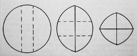
In ‘Cutting a Round Cake on Scientific Principles’ Galton marked intended cuts as broken straight lines, and cuts as solid lines. This method minimizes exposing the insides of the cake to become dry, which would happen if one cuts a slice in the traditional (and, he concludes, ‘very faulty’) way. In the second and third stages the cake is to be held together with an elastic band.
Galton was probably the only man in nineteenth-century Europe who was even more obsessed with gathering data than Quételet was. As a young scientist, Galton took the temperature of his daily pot of tea, together with such information as the volume of boiling water used and how delicious it tasted. His aim was to establish how to make the perfect cuppa. (He reached no conclusions.) In fact, an interest in the mathematics of afternoon tea was a lifelong passion. When he was an old man he sent the diagram above to the journal Nature, which shows his suggestion of the best way to cut a tea-cake in order to keep it as fresh as possible.
Oh, and since this is a book with the word ‘number’ in its title, it would be unsporting for me at this juncture not to mention Galton’s ‘number forms’ – even if they have little to do with the subject of this chapter. Galton was fascinated that a substantial number of people – he estimated 5 percent – automatically and involuntarily envisaged numbers as mental maps. He coined the term number form to describe these maps, and wrote that they have a ‘precisely defined and constant position’ and are such that individuals cannot think of a number ‘without referring to its own particular habitat in their mental field of view’. What is especially interesting about number forms is that they generally show up very peculiar patterns. Instead of a straight line, which might be expected, they often involve rather peculiar twists and turns.
Four examples of Galton’s ‘number forms’: curious spatial representations of numbers.
Number forms have the whiff of Victorian freakishness, perhaps evidence of repressed emotions or overindulgence in opiates. Yet a century later they are researched in academia, recognized as a type of synaesthesia, which is the neurological phenomenon that occurs when stimulation of one cognitive pathway leads to involuntary stimulation in another. In this case, numbers are given a location in space. Other types of synaesthesia include believing letters have colours, or that days of the week have personalities. Galton, in fact, underestimated the presence of number forms in humans. It is now thought that 12 percent of us experience them in some way.
But Galton’s principal passion was measuring. He built an ‘anthropometric laboratory’ – a drop-in centre in London, where members of the public could come to have their height, weight, strength of grip, swiftness of blow, eyesight and other physical attributes measured by him. The lab compiled details on more than 10,000 people, and Galton achieved such fame that Prime Minister William Gladstone even popped by to have his head measured. (‘It was a beautifully shaped head, though low,’ Galton said.) In fact, Galton was such a compulsive measurer that even when he had up very ng obvious to measure he would find something to satisfy his craving. In an article in Nature in 1885 he wrote that while present at a tedious meeting he had begun to measure the frequency of fidgets made by his colleagues. He suggested that scientists should henceforth take advantage of boring meetings so that ‘they may acquire the new art of giving numerical expression to the amount of boredom expressed by [an] audience’.
Galton’s research corroborated Quételet’s in that it showed that the variation in human populations was rigidly determined. He too saw the bell curve everywhere. In fact, the frequency of the appearance of the bell curve led Galton to pioneer the word ‘normal’ as the appropriate name for the distribution. The circumference of a human head and the size of the brain all produced bell curves, though Galton was especially interested in non-physical attributes such as intelligence. IQ tests hadn’t been invented at the time, so Galton looked for other measures of intelligence. He found them in the results of the admission exams to the Royal Military Academy at Sandhurst. The exam scores, he discovered, also conformed to the bell curve. It filled him with a sense of awe. ‘I know of scarcely anything so apt to impress the imagination as the wonderful form of cosmic order expressed by the [bell curve],’ he wrote. ‘The law would have been personified by the Greeks and deified, if they had known of it. It reigns with serenity and in complete self-effacement amidst the wildest confusion. The huger the mob, and the greater the apparent anarchy, the more perfect is its sway. It is the supreme law of unreason.’
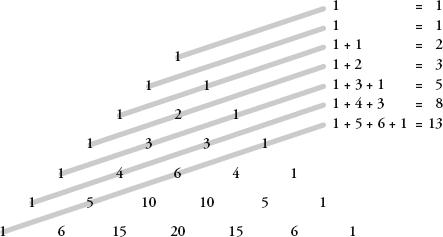
Galton invented a beautifully simple machine that explains the mathematics behind his cherished curve, and he called it the quincunx. The word’s original meaning is the pattern of five dots on a die, and the contraption is a type of pinball machine in which each horizontal line of pins is offset by half a position from the line above. A ball is dropped into the top of the quincunx, and then it bounces between the pins until it falls out the bottom into a rack of columns. After many balls have been dropped in, the shape they make in the columns where they have naturally fallen resembles a bell curve.
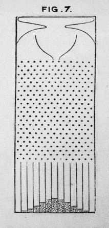
The quincunx.
Using probability, we can understand what is
going on. First, imagine a quincunx with just one pin and let us
say that when a ball hits the pin the outcome is random, with a 50
percent chance that it bounces to the left and a 50 percent chance
of it bouncing to the right. In other words, it has a probability
of  of
ending up one place to the left and a probability of of being one
place to the right.
of
ending up one place to the left and a probability of of being one
place to the right.
Now, let’s add a second row of pins. The ball
will either fall left and then left, which I will call LL, or LR or
RL or RR. Since moving left and then right is equivalent to staying
in the same position, the L and R together cancel each other out
(as does the R and L together), so there is now  of a chance the ball will
end up one place to the left,
of a chance the ball will
end up one place to the left,  chance it will be in the
middle and it will be to the right.
chance it will be in the
middle and it will be to the right.
Repeating this for a third row of pins, the
equally probable options of where the ball will fall are LLL, LLR,
LRL, LRR, RRR, RRL, RLR, RLL. This gives us probabilities of
 of landing on the far left,
  of landing on the near left,
of
landing on the near right and
of landing on the near left,
of
landing on the near right and  of landing on the far
right.
of landing on the far
right.
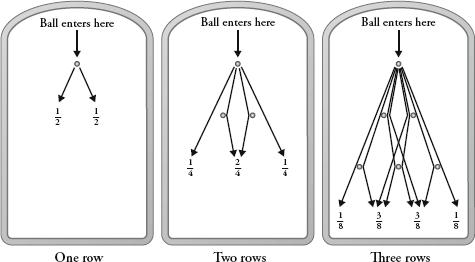
In other words, if there are two rows of pins in the quincunx and we introduce lots of balls into the machine, the law of large numbers says that the balls will fall along the bottom such as to approximate the ratio 1:2:1.
If there are three rows, they will fall in the ratio 1:3:3:1.
If there are four rows, they will fall in the ratio 1:4:6:4:1.
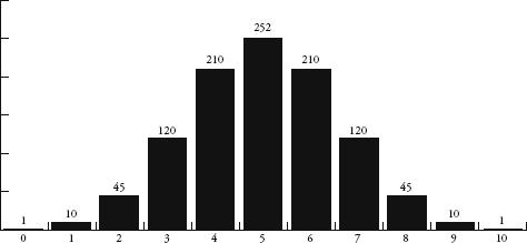
If I carried on working out probabilities, a ten-row quincunx will produce balls falling in the ratio 1:10:45:120:210:252:210:120:45:10:1.
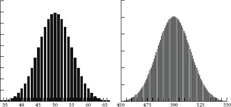
Plotting these numbers gives us the first of the shapes below. The shape becomes even more familiar the more rows we include. Also below are the results for 100 and 1000 rows as bar charts. (Note that only the middle sections of these two charts are shown since the values to the left and right are too small to see.)
So how does this pinball game relate to what goes on in the real world? Imagine that each row of the quincunx is a random variable that will create an error in measurement. Either it will add a small amount to the correct measurement or it will subtract a small amount. In the case of Galileo and his telescope, one row of pins could represent the temperature of the equipment, another could represent whether there is a thermal front passing through, and another could represent the pollution in the air. Each variable contributes an error either one way or the other, just as in the quincunx the ball will bounce left or right. In any measurement there may be many millions of unobservable random errors – their combined errors, however, will give measurements that are distributed like a bell curve.
If the characteristics of a population are normally distributed, in other words are clustered around an average in the shape of a bell curve, and if the bell curve is produced through random error, then, Quételet argued, the variation in human characteristics can be seen as errors from a paradigm. He called this paradigm l’homme moyen, or ‘the average man’. Populations, he said, were made up of deviations from this prototype. In Quételet’s mind, being average was something to aspire to since it was a way of keeping society in check – deviations from the average, he wrote, led to ‘ugliness in body as well as vice in morals’. Even though the concept of l’homme moyen never gained acceptance in science, its use filtered down to society at large. We often talk about morality or taste in terms of what an average representative of a population might think or feel about it: such as what is seen as acceptable ‘in the eyes of the average man’.
Whereas Quételet extolled averageness, Galton looked down on it. Galton, as I mentioned before, saw that exam results were normally distributed. Most people scobout average, while a few got very high marks and a few very low.
Galton, incidentally, was himself from a very above-average family. His first cousin was Charles Darwin, and the two men corresponded regularly about their scientific ideas. About a decade after Darwin published On the Origin of Species, which set out the theory of natural selection, Galton started to theorize on how human evolution itself could be guided. He was interested in the heritability of cleverness and wondered how it might be possible to improve the overall intelligence of a population. He wanted to shift the bell curve to the right. To this end Galton suggested a new field of study about the ‘cultivation of race’, or improving the intellectual stock of a population through breeding. He had thought to call his new science viticulture, from the Latin vita, ‘life’, but eventually settled on eugenics, from the Greek eu, good, and genos, birth. (The usual meaning of ‘viticulture’, grape cultivation, comes from vitis, Latin for ‘vine’, and dates from around the same time.) Even though many liberal intellectuals of the late nineteenth and early twentieth centuries supported eugenics as a way to improve society, the desire to ‘breed’ cleverer humans was an idea that was soon distorted and discredited. In the 1930s eugenics became synonymous with murderous Nazi policies to create a superior Aryan race.
In retrospect, it is easy to see how ranking traits – such as intelligence or racial purity – can lead to discrimination and bigotry. Since the bell curve appears when human features are measured, the curve has become synonymous with attempts to classify some humans as intrinsically better than others. The highest-profile example of this was the publication in 1994 of The Bell Curve by Richard J. Herrnstein and Charles Murray, one of the most fiercely debated books of recent years. The book, which owes its name to the distribution of IQ scores, argues that IQ differences between racial groups are evidence of biological differences. Galton wrote that the bell curve reigned with ‘serenity and in complete self-effacement’. Its legacy, though, has been anything but.
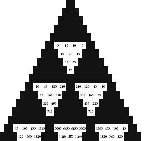
Another way to appreciate the lines of numbers produced by the quincunx is to lay them out like a pyramid. In this form, the results are better known as Pascal’s triangle.
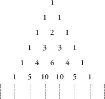
Pascal’s can be constructed much more simply than by working out the distributions of randomly falling balls through a Victorian bean machine. Start with a 1 in the first row, and under it place two 1s so as to make a triangle shape. Continue with subsequent rows, always placing a 1 at the beginning and end of the rows. The value of every other position is the sum of the two numbers above it.
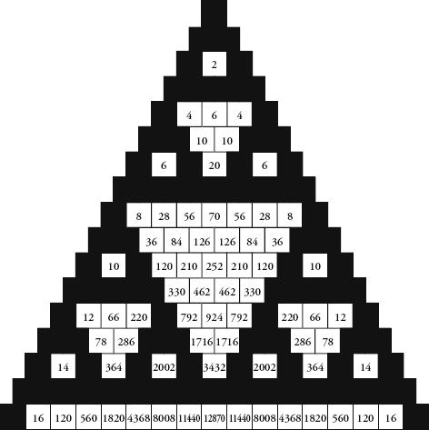
Pascal’s triangle with only squares divisible by 2 in white.
The triangle is named after Blaise Pascal, even though he was a latecomer to its charms. Indian, Chinese and Persian mathematicians were all aware of the pattern centuries before he was. Unlike its prior fans, though, Pascal wrote a book about what he called le triangle arithmétique. He was fascinated by the mathematical richneshe patterns he discovered. ‘It is a strange thing how fertile it is in properties,’ he wrote, adding that in his book he had to leave out more than he could put in.
My favourite feature of Pascal’s triangle is the following. Let each number have its own square, and colour all the odd number squares black. Keep all the even-number squares white. The result is the wonderful mosaic above.
Hang on minute, I hear you say. This pattern looks familiar. Correct. It is reminiscent of the Sierpinski carpet, the piece of mathematical upholstery from p. 105 in which a square is divided into nine subsquares and the central one removed, with the same process being repeated to each of the subsquares ad infinitum. The triangular version of the Sierpinski carpet is the Sierpinski triangle, in which an equilateral triangle is divided into four identical equilateral triangles, of which the middle one is removed. The three remaining triangles are then subject to the same operation – divide into four and remove the middle one. Here are the first three iterations:
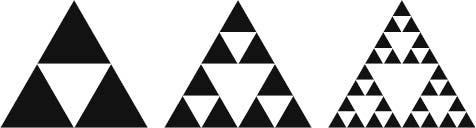
If we extend the method of colouring Pascal’s triangle to more and more lines, the pattern looks more and more like the Sierpinski triangle. In fact, as the limit approaches infinity, Pascal’s triangle becomes the Sierpinski triangle.
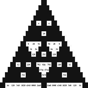
Sierpinski is not the only old friend we find in these black-and-white tiles. Consider the size of the white triangles down the centre of Pascal’s triangle. The first is made up of 1 square, the second is made up of 6 squares, the third is made of 28, and the next ones have 120 and 496 squares. Do these numbers ring any bells? Three of them – 6, 28 and 496 – are perfect numbers, from p. 265. The occurrence is a remarkable visual expression of a seemingly unrelated abstract idea.
Let’s continue painting Pascal’s triangle by numbers. First keep all numbers divisible by 3 as white, and make the rest black. Then repeat the process with the numbers that are divisible by 4. Repeat again with numbers divisible by 5. The results, shown opposite, are all symmetrical patterns of triangles pointing in the opposite direction to the whole.
In the nineteenth century, another familiar face was discovered in Pascal’s triangle: the Fibonacci sequence. Perhaps this was inevitable, as the method of constructing of the triangle was recursive – we repeatedly performed the same rule, which was the adding of two numbers on one line to produce a number on the next line. The recursive summing of two numbers is exactly what we do to produce the Fibonacci sequence. The sum of two consecutive Fibonacci numbers is equal to the next number in the sequence.
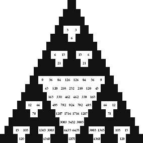
Pascal’s triangle with only squares divisible by 3 in white.
Pascal’s triangle with only squares divisible by 4 in white.
Pascal’s triangle with only squares divisible by 5 in white.
The gentle diagnals in Pascal’s triangle reveal the Fibonacci sequence.
Fibonacci numbers are embedded in the triangle as the sums of what are called the ‘gentle’ diagonals. A gentle diagonal is one that moves from any number to the number underneath to the left and then along one space to the left, or above and to the right and then along one space to the right. The first and second diagonals consist simply of 1. The third has 1 and 1, which equals 2. The fourth has 1 and 2, which adds up to 3. The fifth gentle diagonal gives us 1 + 3 + 1 = 5. The sixth is 1 + 4 + 3 = 8. So far we have generated 1, 1, 2, 3, 5, 8, and the next ones are the subsequent Fibonacci numbers in order.
Ancient Indian interest in Pascal’s triangle concerned combinations of objects. For instance, imagine we have three fruits: a mango, a lychee and a banana. There is only one combination of three items: mango, lychee, banana. If we want to select only two fruits, we can do this in three different ways: mango and lychee, mango and banana, lychee and banana. There are also only three ways of taking the fruit individually, which is each fruit on its own. The final option is to select zero fruit, and this can happen in only one way. In other words, the number of combinations of three different fruits produces the string 1, 3, 3, 1 – the third line of Pascal’s triangle.
If we had four objects, the number of combinations when taken none-at-a-time, individually, two-at-a-time, three-at-a-time and four-at-a-time is 1, 4, 6, 4, 1 – the fourth line of Pascal’s triangle. We can continue this for more and more objects and we see that Pascal’s triangle is really a reference table for the arrangement of things. If we had n items and wanted to know how many combinations we could make of m of them, the answer is exactly the mth position in the nth row of Pascal’s triangle. (Note: by convention, the leftmost 1 of any row is taken as the zeroth position in the row.) For example, how many ways are there of grouping three fruits from a selection of seven fruits? There are 35 ways, since the third position on row seven is 35.
Now let’s move on to start combining mathematical objects. Consider the term x + y. What is (x + y)2? It is the same as (x + y) (x + y). To expand this, we need to multiply each term in the first bracket by each term in the second. So, we get xx + xy + yx + yy, or x2 + 2xy + y2. Spot something here? If we carry on, we can see the pattern more clearly. The coefficients of the individual terms are the rows of Pascal’s triangle.
(x + y)2 = x2 + 2xy + y2
(x + y)3 = x3 + 3x2y + 3xy2 + y3
(x + y)4 = x4 + 4x3y + 6x2y2 + 4xy3 + y4
The mathematician Abraham de Moivre, a Huguenot refugee living in London in the early eighteenth century, was the first to understand that the coefficients of these equations will approximate a curve the more times you multiply (x + y) together. He didn’t call it the bell curve, or the curve of error, or the normal distribution, or the Gaussian distribution, which are the names that it later acquired. The curve made its first appearance in mathematics literature in de Moivre’s 1718 book on gaming called The Doctrine of Chances. This was the first textbook on probability theory, and another example of how scientific knowledge flourished thanks to gambling.
I’ve been treating the bell curve as if it is one curve, when, in fact, it is a family of curves. They all look like a bell, but some are wider than others (see diagram overleaf).
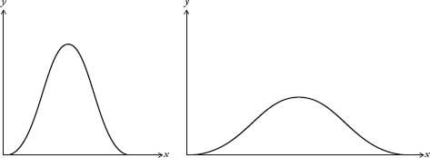
Bell curves with different deviations.
Here’s an explanation for why we get different widths. If Galileo, for example, measured planetary orbits with a twenty-first-century telescope, the margin of error would be less than if he were using his sixteenth-century one. The modern instrument would produce a much thinner bell curve than the antique one. The errors would be much smaller, yet they would still be distributed normally.
The average value of a bell curve is called the mean. The width is called the deviation. If we know the mean and the deviation, then we know the shape of the curve. It is incredibly convenient that the normal curve can be described using only two parameters. Perhaps, though, it is too convenient. Often statisticians are overly eager to find the bell curve in their data. Bill Robinson, an economist who heads KPMG’s forensic-accounting division, admits this is the case. ‘We love to work with normal distributions because [the normal distribution] has mathematical properties that have been very well explored. Once we know it’s a normal distribution, we can start to make all sorts of interesting statements.’
Robinson’s job, in basic terms, is to deduce, by looking for patterns in huge data sets, whether someone has been cooking the books. He is carrying out the same strategy that Poincaré used when he weighed his loaves every day, except that Robinson is looking at gigabytes of financial data, and has much more sophisticated statistical tools at his disposal.
Robinson said that his department tends to work on the assumption that for any set of data the default distribution is the normal distribution. ‘We like to assume that the normal curve operates because then we are in the light. Actually, sometimes it doesn’t, and sometimes we probably should be looking in the dark. I think in the financial markets it is true that we have assumed a normal distribution when perhaps it doesn’t work.’ In recent years, in fact, there has been a backlash in both academia and finance against the historic reliance on the normal distribution.
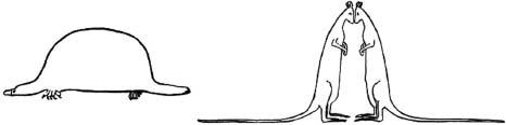
When a distribution is less concentrated around the mean than the bell curve it is called platykurtic, from the Greek words platus, meaning ‘flat’, and kurtos, ‘bulging’. Conversely, when a distribution is more concentrated around the mean it is called leptokurtic, from the Greek leptos, meaning ‘thin’. William Sealy Gosset, a statistician who worked for the Guinness brewery in Dublin, drew the aide-memoire below in 1908 to remember which was which: a duck-billed platypus was platykurtic, and the kissing kangaroos were leptokurtic. He chose kangaroos because they are ‘noted for “lepping”, though, perhaps, with equal reason they should be hares!’ Gosset’s sketches are the origin of the term tail for describing the far-left and far-right sections of a distribution curve.
When economists talk of distributions that are fat-tailed or heavy-tailed, they are talking of curves that stay higher than normal from the axis at the extremes, as if Gosset’s animals have larger than average tails. These curves describe distributions in which extreme events are more likely than if the distribution were normal. For instance, if the variation in the price of a share were fat-tailed, it would mean there was more of a chance of a dramatic drop, or hike, in price than if the variation were normally distributed. For this reason, it can sometimes be reckless to assume a bell curve over a fat-tailed curve. The economist Nassim Nicholas Taleb’s position in his bestselling book The Black Swan is that we have tended to underestimate the size and importance of the tails in distribution curves. He argues that the bell curve is a historically defective model because it cannot anticipate the occurrence of, or predict the impact of, very rare, extreme events – such as a major scientific discovery like the invention of the internet, or of a terrorist attack like 9/11. ‘The ubiquity of the [normal distribution] is not a property of the world,’ he writes, ‘but a problem in our minds, stemming from the way we look at it.’
Platykurtic and leptokurtic distributions.
The desire to see the bell curve in data is perhaps most strongly felt in education. The awarding of grades from A to E in end-of-year exams is based on where a pupil’s score falls on a bell curve to which the distribution of grades is expected to approximate. The curve is divided into sections, with A representing the top section, B the next section down, and so on. For the education system to run smoothly, it is important that the percentage of pupils getting grades A to E each year is comparable. If there are too many As, or too many Es, in one particular year the consequences – not enough, or too many, people on certain courses – would be a strain on resources. Exams are specifically designed in the hope that the distribution of results replicates the bell curve as much as possible – irrespective of whether or not this is an accurate reflection of real intelligence. (It might be as a whole, but is probably not in all cases.)
It has even been argued that the reverence some scientists have for the bell curve actively encourages sloppy practices. We saw from the quincunx that random errors are distributed normally. So, the more random errors we can introduce into measurement, the more likely it is that we will get a bell curve from the data – even if the phenomenon being measured is not normally distributed. When the normal distribution is found in a set of data, this could simply be because the measurements have been gathered too shambolically.
Which brings me back to my baguettes. Were their weights really normally distributed? Was the tail thin or fat? First, a recap. I weighen argued00 baguettes. The distribution of their weights was chapter 10. The graph showed some hopeful trends – there was a mean of somewhere around 400g, and a more or less symmetrical spread between 380 and 420g. If I had been as indefatigable as Henri Poincaré, I would have continued the experiment for a year and had 365 (give or take days of bakery closure) weights to compare. With more data, the distribution would have been clearer. Still, my smaller sample was enough to get an idea of the pattern forming. I used a trick, compressing my results by redrawing the graph with a scale that grouped baguette weights in bounds of 8g rather than 1g. This created the following graph:
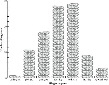
When I first drew this out I felt relief, as it really looked like my baguette experiment was producing a bell curve. My facts appeared to be fitting the theory. A triumph for applied science! But when I looked closer, the graph wasn’t really like the bell curve at all. Yes, the weights were clustered around a mean, but the curve was clearly not symmetrical. The left side of the curve was not as steep as the right side. It was as if there was an invisible magnet stretching the curve a little to the left.
I could therefore conclude one of two things. Either the weights of Greggs’ baguettes were not normally distributed, or they were normally distributed but some bias had crept in to my experimentation process. I had an idea of what the bias might be. I had been storing the uneaten baguettes in my kitchen, and I decided to weigh one that was a few days old. To my surprise it was only 321g – significantly lower than the lowest weight I had measured. It dawned on me then that baguette weight was not fixed because bread gets lighter as it dries out. I bought another loaf and discovered that a baguette loses about 15g between 8 a.m. and noon.
It was now clear that my experiment was flawed. I had not taken into account the hour of the day when I took my measurements. It was almost certain that this variation was providing a bias to the distribution of weights. Most of the time I was the first person in the shop, and weighed my loaf at about 8.10 a.m., but sometimes I got up late. This random variable was not normally distributed since the mean would have been between 8 and 9 a.m., but there was no tail before 8 a.m. since the shop was closed. The tail on the other side went all the way to lunchtime.
Then something else occurred to me. What about the ambient temperature? I had started my experiment at the beginning of spring. It had ended at the beginning of summer, when the weather was significantly hotter. I looked at the figures and saw that my baguette weights were lighter on the whole towards the end of the project. The summer heat, I assumed, was drying them out faster. Again, this variation could have had the effect of stretching the curve leftwards.
My experiment may have shown that baguette weights approximated a slightly distorted bell curve, yet what I had really learned was that measurement is never so simple. The normal distribution is a theoretical ideal, and one cannot assume that all results will conform to it. I wondered about Henri Poincaré. When he measured his bread did he eliminate bias due to the Parisian weather, or the time of day of his measurements? Perhaps he had not demonstrated that he was being sold a 950g loaf instead of a 1kg loaf at all, but had instead proved that from baking to measuring, a 1kg loaf reduces in weight by 50g.
The history of the bell curve, in fact, is a wonderful parable about the curious kinship between pure and applied scientists. Poincaré once received a letter from the French physicist Gabriel Lippmann, who brilliantly summed up why the normal distribution was so widely exalted: ‘Everybody believes in the [bell curve]: the experimenters because they think it can be proved by mathematics; and the mathematicians because they believe it has been established by observation.’ In science, as in so many other spheres, we often choose to see what serves our interests.
Francis Galton devoted himself to science and exploration in the way that only a man in possession of a large fortune can do. His early adulthood was spent leading expeditions to barely known parts of Africa, which brought him considerable fame. A masterful dexterity with scientific instruments enabled him, on one occasion, to measure the figure of a particularly buxom Hottentot by standing at a distance and using his sextant. This incident, it seems, was indicative of a desire to keep women at arm’s length. When a tribal chief later presented him with a young woman smeared in butter and red ochre in preparation for sex – Galton declined the offer, concerned she would smudge his white linen suit.
Eugenics was Galton’s most infamous scientific legacy, yet it was not his most enduring innovation. He was the first person to use questionnaires as a method of psychological testing. He devised a classification system for fingerprints, still in use today, which led to their adoption as a tool in police investigations. And he thought up a way of illustrating the weather, which when it appeared in The Times in 1875 was the first public weather map to be published.
That same year, Galton decided to recruit some of his friends for an experiment with sweet peas. He distributed seeds among seven of them, asking them to plant the seeds and return the offspring. Galton measured the baby seeds and compared their diameters to those of their parents. He noticed a phenomenon that initially seems counter-intuitive: the large seeds tended to produce smaller offspring, and the small seeds tended to produce larger offspring. A decade later he analysed data from his anthropometric laboratory and recognized the same pattern with human heights. After measuring 205 pairs of parents and their 928 adult children, he saw that exceptionally tall parents had kids who were generally shorter than they were, while exceptionally short parents had children who were generally taller than their parents.
After reflecting upon this, we can understand why it must be the case. If very tall parents always produced even taller children, and if very short parents always produced even shorter ones, we would by now have turned into a race of giants and midgets. Yet this hasn’t happened. Human populations may be getting taller as a whole – due to better nutrition and public health – but the distribution of heights within the population is still contained.
Galton called this phenomenon ‘regression towards mediocrity in hereditary stature’. The concept is now more generally known as regression to the mean. In a mathematical context, regression to the mean is the statement that an extreme event is likely to be followed by a less extreme event. For example, when I measured a Greggs baguette and got 380g, a very low weight, it was very likely that the next baguette would weigh more than 380g. Likewise, after finding a 420g baguette, it was very likely that the following baguette would weigh less than 420g. The quincunx gives us a visual representation of the mechanics of regression. If a ball is put in at the top and then falls to the furthest position on the left, then the next ball dropped will probably land closer t the middle position – because most of the balls dropped will land in the middle positions.
Variation in human height through generations, however, follows a different pattern from variation in baguette weight through the week or variation in where a quincunx ball will land. We know from experience that families with above-average-sized parents tend to have above-average-sized kids. We also know that the shortest guy in the class probably comes from a family with adults of correspondingly diminutive stature. In other words, the height of a child is not totally random in relation to the height of his parents. On the other hand, the weight of a baguette on a Tuesday probably is random in relation to the weight of a baguette on a Monday. The position of one ball in a quincunx is (for all practical purposes) random in relation to any other ball dropped.
In order to understand the strength of
association between parental height and child height, Galton came
up with another idea. He plotted a graph with parental height along
one axis and child height along the other, and then drew a straight
line through the points that best fitted their spread. (Each set of
parents was represented by the height midway between mother and
father – which he called the ‘mid-parent’). The line had a gradient
of  . In
other words for every inch taller than the average that the
mid-parent was, the child would only be of an inch taller than the
average. For every inch shorter than the average the mid-parent
was, the child would only be of an inch shorter than the
average. Galton called the gradient of the line the
coefficient of
correlation. The coefficient is a number that
determines how strongly two sets of variables are related.
Correlation was more fully developed by Galton’s protégé Karl
Pearson, who in 1911 set up the world’s first university statistics
department, at University College London.
. In
other words for every inch taller than the average that the
mid-parent was, the child would only be of an inch taller than the
average. For every inch shorter than the average the mid-parent
was, the child would only be of an inch shorter than the
average. Galton called the gradient of the line the
coefficient of
correlation. The coefficient is a number that
determines how strongly two sets of variables are related.
Correlation was more fully developed by Galton’s protégé Karl
Pearson, who in 1911 set up the world’s first university statistics
department, at University College London.
Regression and correlation were major breakthroughs in scientific thought. For Isaac Newton and his peers, the universe obeyed deterministic laws of cause and effect. Everything that happened had a reason. Yet not all science is so reductive. In biology, for example, certain outcomes – such as the occurrence of lung cancer – can have multiple causes that mix together in a complicated way. Correlation provided a way to analyse the fuzzy relationships between linked sets of data. For example, not everyone who smokes will develop lung cancer, but by looking at the incidence of smoking and the incidence of lung cancer mathematicians can work out your chances of getting cancer if you do smoke. Likewise, not every child from a big class in school will perform less well than a child from a small class, yet class sizes do have an impact on exam results. Statistical analysis opened up whole new areas of research – in subjects from medicine to sociology, from psychology to economics. It allowed us to make use of information without knowing exact causes. Galton’s original insights helped make statistics a respectable field: ‘Some people hate the very name of statistics, but I find them full of beauty and interest,’ he wrote. ‘Whenever they are not brutalized, but delicately handled by the higher methods, and are warily interpreted, their power of dealing with complicated phenomena is extraordinary.’
In 2002 the Nobel Prize in Economics was not won by an economist. It was won by the psychologist Daniel Kahneman, who had spent his career (much of it together with his colleague Amos Tversky) stdying the cognitive factors behind decision-making. Kahneman has said that understanding regression to the mean led to his most satisfying ‘Eureka moment’. It was in the mid 1960s and Kahneman was giving a lecture to Israeli air-force flight instructors. He was telling them that praise is more effective than punishment for making cadets learn. On finishing his speech, one of the most experienced instructors stood up and told Kahneman that he was mistaken. The man said: ‘On many occasions I have praised flight cadets for clean execution of some aerobatic manœuvre, and in general when they try it again, they do worse. On the other hand, I have often screamed at cadets for bad execution, and in general they do better the next time. So please don’t tell us that reinforcement works and punishment does not, because the opposite is the case.’ At that moment, Kahneman said, the penny dropped. The flight instructor’s opinion that punishment is more effective than reward was based on a lack of understanding of regression to the mean. If a cadet does an extremely bad manœuvre, then of course he will do better next time – irrespective of whether the instructor admonishes or praises him. Likewise, if he does an extremely good one, he will probably follow that with something less good. ‘Because we tend to reward others when they do well and punish them when they do badly, and because there is regression to the mean, it is part of the human condition that we are statistically punished for rewarding others and rewarded for punishing them,’ Kahneman said.
Regression to the mean is not a complicated idea. All it says is that if the outcome of an event is determined at least in part by random factors, then an extreme event will probably be followed by one that is less extreme. Yet despite its simplicity, regression is not appreciated by most people. I would say, in fact, that regression is one of the least grasped but most useful mathematical concepts you need for a rational understanding of the world. A surprisingly large number of simple misconceptions about science and statistics boil down to a failure to take regression to the mean into account.
Take the example of speed cameras. If several accidents happen on the same stretch of road, this could be because there is one cause – for example, a gang of teenage pranksters have tied a wire across the road. Arrest the teenagers and the accidents will stop. Or there could be many random contributing factors – a mixture of adverse weather conditions, the shape of the road, the victory of the local football team or the decision of a local resident to walk his dog. Accidents are equivalent to an extreme event. And after an extreme event, the likelihood is of less extreme events occurring: the random factors will combine in such a way as to result in fewer accidents. Often speed cameras are installed at spots where there have been one or more serious accidents. Their purpose is to make drivers go more slowly so as to reduce the number of crashes. Yes, the number of accidents tends to be reduced after speed cameras have been introduced, but this might have very little to do with the speed camera. Because of regression to the mean, whether or not one is installed, after a run of accidents it is already likely that there will be fewer accidents at that spot. (This is not an argument against speed cameras, since they may indeed be effective. Rather it is an argument about the argument for speed cameras, which often displays a misuse of statistics.)
My favourite example of regression to the mean is the ‘curse of Sports Illustrated’, a bizarre phenomenon by which sportsmen suffer a marked drop in form immediately after appearing on the cover of America’s top sports magazine. The curse is as old as the first issue. In August 1954 basball player Eddie Mathews was on the cover after he had led his team, the Milwaukee Braves, to a nine-game winning streak. Yet as soon as the issue was on the news-stands, the team lost. A week later Mathews picked up an injury that forced him to miss seven games. The curse struck most famously in 1957, when the magazine splashed on the headline ‘Why Oklahoma is Unbeatable’ after the Oklahoma football team had not lost in 47 games. Yet sure enough, on the Saturday after publication, Oklahoma lost 7–0 to Notre Dame.
One explanation for the curse of Sports Illustrated is the psychological pressure of being on the cover. The athlete or team becomes more prominent in the public eye, held up as the one to beat. It might be true in some cases that the pressure of being a favourite is detrimental to performance. Yet most of the time the curse of Sports Illustrated is simply an illustration of regression to the mean. For someone to have earned their place on the cover of the magazine, they will usually be on top form. They might have had an exceptional season, or just won a championship or broken a record. Sporting performance is due to talent, but it is also reliant on many random factors, such as whether your opponents have the flu, whether you get a puncture, or whether the sun is in your eyes. A best-ever result is comparable to an extreme event, and regression to the mean says that after an extreme event the likelihood is of one less extreme.
Of course, there are exceptions. Some athletes are so much better than the competition that random factors have little sway on their performances. They can be unlucky and still win. Yet we tend to underestimate the contribution of randomness to sporting success. In the 1980s statisticians started to analyse scoring patterns of basketball players. They were stunned to find that it was completely random whether or not a particular player made or missed a shot. Of course, some players were better than others. Consider player A, who scores 50 percent of his shots, on average; in other words, he has an equal chance of scoring or missing. Researchers discovered that the sequence of baskets and misses made by player A appeared to be totally random. In other words, instead of shooting he might as well have flipped a coin.
Consider player B, who has a 60 percent chance of scoring and a 40 percent chance of missing. Again, the sequence of baskets was random, as if the player was flipping a coin biased 60–40 instead of actually throwing the ball. When a player makes a run of baskets pundits will eulogize him for playing well, and when he makes a run of misses he will be criticized for having an off day. Yet making or missing a basket in one shot has no effect on whether he will make or miss it on the next shot. Each shot is as random as the flip of a coin. Player B can be genuinely praised for having a 60–40 score ratio on average over many games, but praising him for any sequence of five baskets in a row is no different from praising the talent of a coin flipper who gets five consecutive heads. In both cases, they had a lucky streak. It is also possible – if not entirely probable – that player A, who is not as good overall at making baskets as player B, might have a longer run of successful shots in a match. This does not mean he is a better player. It is randomness giving A a lucky streak and B an unlucky one.
More recently, Simon Kuper and Stefan Szymanski looked at the 400 games the England football team has played since 1980. They write, in Why England Lose: ‘England’s win sequence…is indistinguishable from a random series of coin tosses. There is no predictive value in the outcome of England’s last game, or indeed in any combination of England’s games. Whatever happened in one match appears to have no bearing on what will happen in the next one. The only thing you can predict is that over the medium to long term, England will win about half its games outright.’
The ups and downs of sporting performance are often explained by randomness. After a very big up you might get a call from Sports Illustrated. And you are almost guaranteed that your performance will slump.