12 Working with Transparency
Lesson Overview
In this lesson, you’ll learn how to do the following:
-
Colorize an imported grayscale image.
-
Change the opacity of objects drawn in InDesign.
-
Apply transparency settings to imported graphics.
-
Apply transparency settings to text.
-
Apply blending modes to overlapping objects.
-
Apply feathering effects to objects.
-
Add a drop shadow to text.
-
Apply multiple effects to an object.
-
Edit and remove effects.

This lesson will take about 75 minutes to complete.
Please log in to your account on peachpit.com to download the lesson files for this chapter, or go to the “Getting Started” section at the beginning of this book and follow the instructions under “Accessing the Lesson Files and Web Edition.” Store the files on your computer in a convenient location.

Adobe InDesign offers an array of transparency features to feed your imagination and creativity. These include controls over opacity, special effects, and color blends. You can also import graphic files that use transparency and apply additional transparency effects.
Getting started
The project for this lesson is the cover of a menu for a fictional restaurant, Bistro Nouveau. By applying transparency effects and using multiple layers, you’ll create a visually rich design.
 Note: If you have not already
downloaded the project files for this lesson to your computer from
your Account page, make sure to do so now. See “Getting Started” at the beginning of the
book.
Note: If you have not already
downloaded the project files for this lesson to your computer from
your Account page, make sure to do so now. See “Getting Started” at the beginning of the
book.
-
To ensure that the preferences and default settings of your Adobe InDesign program match those used in this lesson, move the InDesign Defaults file to a different folder following the procedure in “Saving and restoring the InDesign Defaults file” on pages 4–5.
-
Start Adobe InDesign. To ensure that the panels and menu commands match those used in this lesson, choose Window > Workspace > [Advanced], and then choose Window > Workspace > Reset Advanced. To begin working, you’ll open an InDesign document that is already partially completed.
-
Choose File > Open, and open the 12_Start.indd file in the Lesson12 folder, which is located within the Lessons folder in the InDesignCIB folder on your hard drive. (If the Missing Fonts dialog box displays, click Sync Fonts, and then click Close after the fonts have successfully synced from Typekit.)
-
Choose File > Save As, name the file 12_Menu.indd, and save it in the Lesson12 folder.
The menu appears as a long, blank page because all the layers that contain objects are currently hidden. You’ll reveal these layers one by one as you need them, so it will be easy to focus on the specific objects and tasks in this lesson.
-
To see what the finished project looks like, open the 12_End.indd file in the Lesson12 folder.

-
When you are ready to start working, either close the 12_End.indd file or leave it open for your reference. Then return to your lesson document by choosing 12_Menu.indd from the Window menu or clicking the 12_Menu.indd tab in the upper-left corner of the document window.
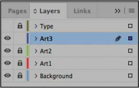
Importing and colorizing a grayscale image
You’ll begin by working with the Background layer for the restaurant menu. This layer serves as a textured background visible through the objects above it that have transparency effects. By applying transparency effects, you can create see-through objects that reveal any objects underneath.
Because nothing is below the Background layer in the layer stack, you won’t apply any transparency effects to objects on this layer.
-
Choose Window > Layers to display the Layers panel.
-
In the Layers panel, select the layer labeled Background, scrolling as necessary to find it at the bottom of the layer stack. You’ll place the image you import on this layer.
-
Make sure that the two boxes to the left of the layer name show that the layer is visible (the eye icon [
 ]
appears) and unlocked (the layer lock icon [
]
appears) and unlocked (the layer lock icon [ ] does not appear). The
pen icon (
] does not appear). The
pen icon ( ) to the right of the layer name indicates
that this is the layer on which the imported objects will be placed
and new frames will be created.
) to the right of the layer name indicates
that this is the layer on which the imported objects will be placed
and new frames will be created.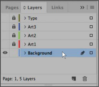
-
Choose View > Grids & Guides > Show Guides. You’ll use the guides on the page to align the background image that you import.
 Tip: TIFF stands for Tagged
Image File Format, a common bitmap graphic format often used for
print publishing. TIFF files use the .tif file extension.
Tip: TIFF stands for Tagged
Image File Format, a common bitmap graphic format often used for
print publishing. TIFF files use the .tif file extension. -
Choose File > Place, and then open the 12_Background.tif file in your Lesson12 folder. This file is a grayscale TIFF.
-
Move the loaded raster graphics icon (
 )
slightly outside the upper-left corner of the page; then click the
corner where the red bleed guides meet so that the placed image
fills the entire page, including the margins and bleed area. Keep
the graphics frame selected.
)
slightly outside the upper-left corner of the page; then click the
corner where the red bleed guides meet so that the placed image
fills the entire page, including the margins and bleed area. Keep
the graphics frame selected.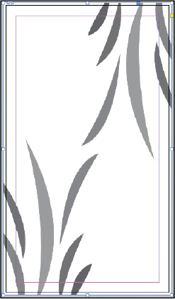
-
Choose Window > Color > Swatches. You’ll use the Swatches panel to colorize the graphics frame and the image.
Tip: InDesign offers many
convenient ways to apply colors. You can also select the Fill box
at the bottom of the Tools panel, and you can choose a fill color
from the Fill menu in the Control panel. -
In the Swatches panel, select Fill color (
 ).
Scroll down the list of swatches to find the Light Green swatch and
select it. Click the Tint menu at the top of the panel and drag the
slider to 76%.
).
Scroll down the list of swatches to find the Light Green swatch and
select it. Click the Tint menu at the top of the panel and drag the
slider to 76%.The white background of the graphics frame is now a 76% tint of the green color, but the gray areas of the graphic remain unchanged.
-
Using the Selection tool (
 ), move the pointer within
the content grabber at the center of the frame. When the hand
pointer (
), move the pointer within
the content grabber at the center of the frame. When the hand
pointer ( ) appears, click to select the graphic
instead of the frame, and then select Light Green in the Swatches
panel. Light Green replaces gray in the image, leaving the Light
Green 76% fill color for the frame unchanged.
) appears, click to select the graphic
instead of the frame, and then select Light Green in the Swatches
panel. Light Green replaces gray in the image, leaving the Light
Green 76% fill color for the frame unchanged.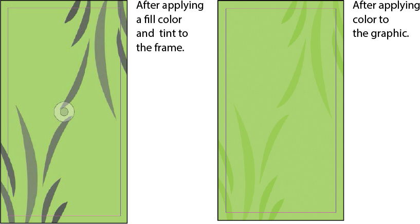
InDesign lets you apply color to grayscale or bitmap images saved in PSD, TIFF, BMP, or JPEG format. When you select the graphic within a graphics frame and then apply a fill color, the color is applied to the gray portions of the image rather than to the background of the frame, as it was in step 8, when the frame was selected.
-
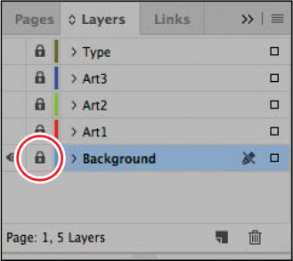
In the Layers panel, click the empty box to the left of the Background layer name to lock the layer. Leave the Background layer visible so that you can see the results of the transparent objects you will be placing above this layer.
-
Choose File > Save to save your work.
You’ve just learned a quick method for colorizing a grayscale image. While this method works well for creating composites, you may find the color controls available in Adobe Photoshop more effective for creating your final artwork.
Applying transparency settings
InDesign has extensive transparency controls. For example, by lowering the opacity of objects, text, and even imported graphics, you can reveal underlying objects that would otherwise not be visible. Additional transparency features, such as blending modes, drop shadows, feathered and glowing edges, and bevel and emboss effects, provide a wide range of options for creating special visual effects. You’ll learn about these additional features later in the lesson.
Tip: Applying a blending mode
lets you vary the ways in which the colors of overlapping objects
blend with each other.
In this part of the project, you’ll practice using a variety of transparency features on several objects placed on the various layers in the menu.
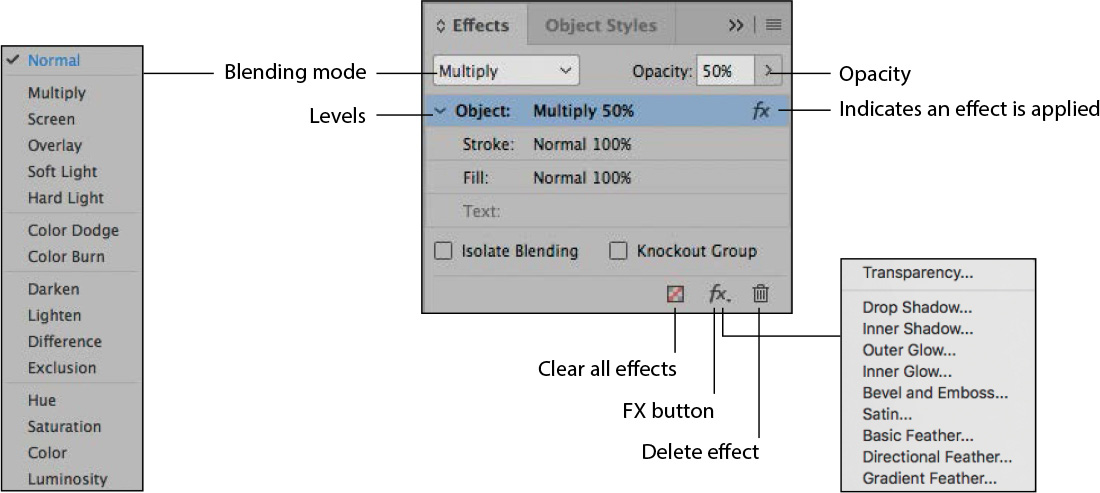
About the Effects panel
You use the Effects panel (Window > Effects) to specify the opacity and blending mode of objects and groups, isolate blending to a particular group, knock out objects in a group, and apply a transparency effect.
Changing the opacity of solid-color objects
With the background graphic complete, you can start applying transparency effects to objects on layers stacked above it. You’ll start with a series of simple shapes that were drawn using InDesign.
-
In the Layers panel, select the Art1 layer so that it becomes the active layer, and click the lock icon (
) to
the left of the layer name to unlock the layer. Click the empty box
on the far left of the Art1 layer name so that the eye icon
()
appears, indicating that the layer is now visible.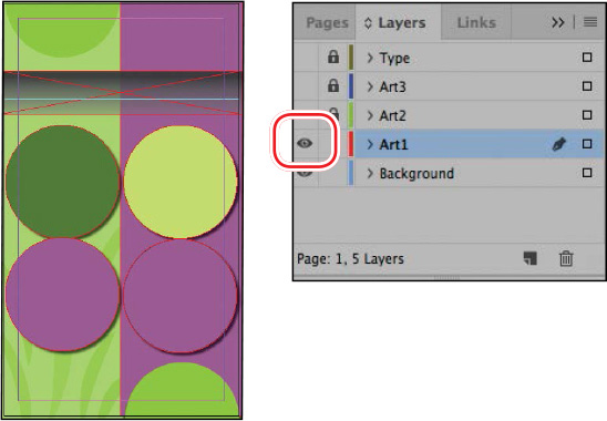 Note: The shapes mentioned
are named by the color swatch applied to the fill of the object. If
the Swatches panel is not open, choose Window > Color >
Swatches to open it.
Note: The shapes mentioned
are named by the color swatch applied to the fill of the object. If
the Swatches panel is not open, choose Window > Color >
Swatches to open it. -
Using the Selection tool (
), click the full circle
filled with the Yellow/Green swatch on the right side of the page.
This ellipse frame with a solid fill was drawn in InDesign. -
Choose Window > Effects to display the panel.
-
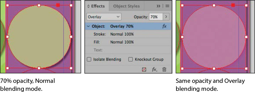
In the Effects panel, click the arrow on the right side of the Opacity percentage. An Opacity slider adjustment appears. Drag the slider to 70%. Alternatively, enter 70% in the Opacity box and press Enter or Return.
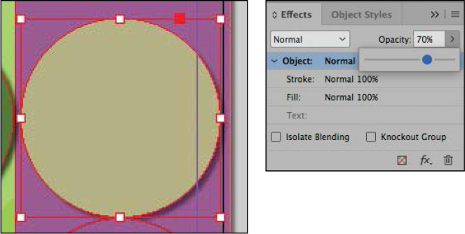
After you change the opacity of the Yellow/Green circle, it becomes translucent, and the resulting color is a combination of the Yellow/Green fill of the circle and the Light Purple rectangle below it that covers the right half of the page.
-
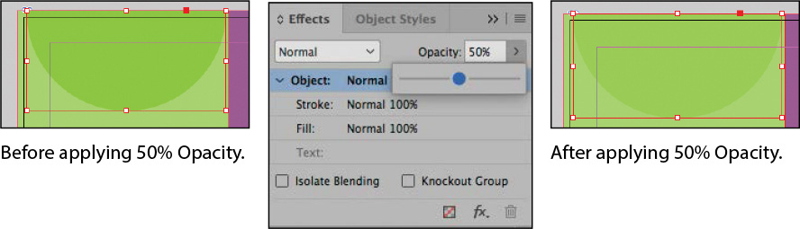
Select the Light Green–filled semicircle in the upper-left corner of the page, and then go to the Effects panel and set the Opacity value to 50%. The semicircle now appears as a subtle variation in color against the background.
-
Repeat step 5 for the following three circles on the Art1 layer, using the following settings to change the opacity of each circle:
-
Left side, middle circle filled with the Medium Green swatch, Opacity = 60%.
-
Left side, bottom circle filled with the Light Purple swatch, Opacity = 70%.
-
Right side, bottom semicircle filled with the Light Green swatch, Opacity = 50%.
-
-
Choose File > Save to save your work.
Applying a blending mode
Changing an object’s opacity creates a color that combines the color applied to an object with the colors applied to objects below it. Using blending modes is another way to create color interactions between stacked objects.
In this procedure, you’ll apply a blending mode to three objects on the page.
-
Using the Selection tool (
), select the
Yellow/Green–filled circle on the right side of the page. -
In the Effects panel, choose Overlay from the Blending Mode menu. Notice how the appearance of the colors changes.
-
Select the Light Green–filled semicircle in the lower-right corner of the page, and then hold down the Shift key and select the Light Green–filled semicircle in the upper-left corner of the page.
-
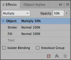
In the Effects panel, choose Multiply from the Blending Mode menu.
-
Choose File > Save.
For more information on the different blending modes, see “Specify how colors blend” in InDesign Help.
Adding transparency effects to imported vector and bitmap graphics
So far in this lesson, you have applied various transparency settings to objects drawn using InDesign. You can also apply opacity values and blending modes to imported graphics created with other applications, such as Adobe Illustrator and Adobe Photoshop.
Applying transparency to a vector graphic
-
In the Layers panel, select the Art2 layer. Unlock this layer and make it visible.
-
In the Tools panel, make sure that the Selection tool (
) is selected. -
On the left side of the page, select the graphics frame that contains the black spiral image by clicking within the frame when the arrow pointer (
 ) is displayed. (Don’t click
within the content grabber when the hand pointer [
) is displayed. (Don’t click
within the content grabber when the hand pointer [ ] is displayed or you’ll
select the graphic rather than the frame.) This frame is in front
of a Medium Green–colored circle.
] is displayed or you’ll
select the graphic rather than the frame.) This frame is in front
of a Medium Green–colored circle. -
With the black spiral frame still selected, hold down the Shift key and click to select the graphics frame that contains a black spiral on the right side of the page. This frame is in front of and within a Light Purple–colored circle. Again, make sure you select the graphics frame and not the graphic within. Both of the graphics frames with spirals should now be selected.
-
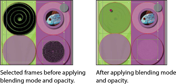
In the Effects panel, choose Color Dodge from the Blending Mode menu and set the Opacity value to 30%.
Next you will apply a blending mode to the stroke on the fish image.
-
With the Selection tool (
), select the circular
graphics frame with the fish image on the right side of the page.
Make sure the arrow pointer () and not the hand pointer () is displayed
when you click. -
In the Effects panel, click the Stroke level beneath Object to select it. Selecting the Stroke level applies any blending mode or opacity changes you make to only the stroke of the selected object.
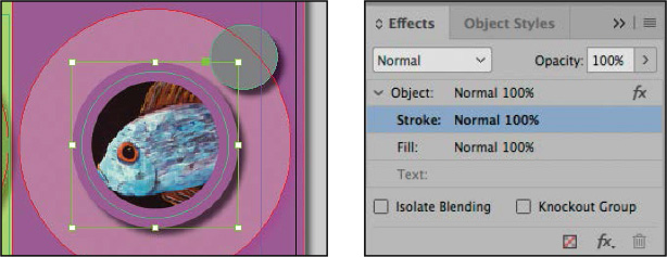
A level indicates the Object, Stroke, Fill, and Text opacity settings of the selected object and the applied blending mode, as well as whether transparency effects have been applied. This means you can apply different transparency effects to the stroke or fill or text of the same object. You can hide or display these level settings by clicking the triangle to the left of the word Object (or Group or Graphic, depending on the selection).
-
From the Blending Mode drop-down menu, choose Hard Light.
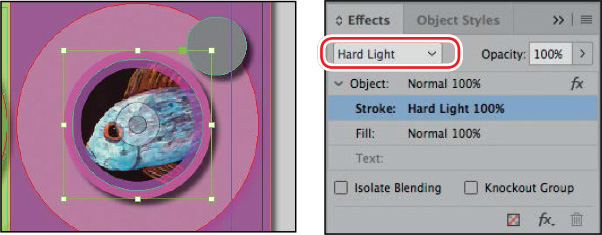
-
Choose Edit > Deselect All, and then choose File > Save to save your work.
Applying transparency to a bitmap graphic
Next you’ll apply transparency effects to an imported bitmap graphic. Although this example uses a monochromatic image, you can also apply transparency settings to multicolor photographs. The process is the same as applying transparency effects to any other InDesign object.
-
In the Layers panel, select the Art3 layer. Unlock this layer and make it visible. You can hide or lock either the Art1 layer or the Art2 layer to make it easier to work. Be sure to keep at least one underlying layer visible so that you can see the results of the transparency interactions.
-
Using the Selection tool (
), select the graphics
frame with the black starburst image on the right side of the page.
Because it’s on the Art3 layer, the frame edge is displayed in
blue, the color of the layer.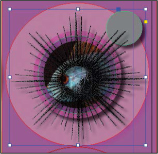
-
In the Effects panel, enter 70% as the Opacity value and press Enter or Return.
-
Move the pointer within the content grabber in the middle of the starburst image so that it changes to a hand (
), and
then click once to select the graphic within the frame. -
In the Swatches panel, select Fill color (
), and
then select the Red color swatch so that red replaces the black
areas of the image.If other layers are visible below the Art3 layer, you can see the starburst as a muted orange color. If no other layers are visible, the starburst is red.
-
If the starburst image is not still selected, reselect it by clicking within the content grabber.
Note: If you hid any layers
in step 1, your screen may look slightly different than the example
here. -
In the Effects panel, choose Screen from the Blending Mode menu and leave the Opacity value at 100%. The starburst changes colors based on the layers visible beneath it. Notice how the result is different when the starburst is over different backgrounds, such as the pink circle compared to the gray circle.
-
Choose Edit > Deselect All, and then choose File > Save to save your work.
Importing and adjusting Illustrator files that use transparency
When you import Adobe Illustrator (.ai) files into an InDesign layout, InDesign recognizes and preserves any transparency settings that were applied in Illustrator. You can also adjust opacity, add a blending mode, and apply additional transparency effects in InDesign.
Now you will place an image of some drinking glasses, and then adjust its transparency.
-
Choose View > Fit Page In Window.
-
In the Layers panel, make sure that the Art3 layer is the active layer and that the Art3, Art2, Art1, and Background layers are visible (
). -
Lock the Art2, Art1, and Background layers to prevent them from being modified.
-
Select the Selection tool (
) in the Tools panel, and
then choose Edit > Deselect All to ensure that the image you
import is not placed into a selected frame. Tip: To enable Show Import
Options without selecting the option in the Place dialog box,
select the graphic to import; then press the Shift key and click
Open. -
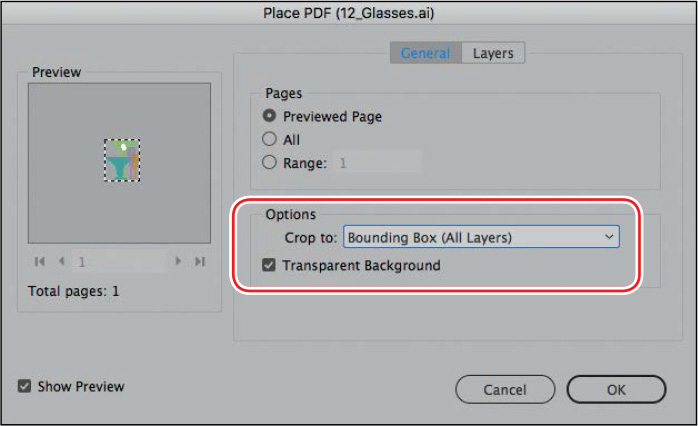
Choose File > Place. Select Show Import Options at the bottom of the Place dialog box. (You might have to click the Options button to see this choice.)
-
Locate the 12_Glasses.ai file in your Lesson12 folder, and double-click or click Open.
-
In the Place PDF dialog box, choose Bounding Box (All Layers) from the Crop To menu, and make sure that Transparent Background is selected.
-
Click OK. The dialog box closes, and the pointer becomes a loaded vector graphics icon (
 ) with a preview of the
file. Tip: When repositioning the
image, Smart Guides can help you center the image perfectly within
the purple circle.
) with a preview of the
file. Tip: When repositioning the
image, Smart Guides can help you center the image perfectly within
the purple circle. -
Position the loaded vector graphics icon (
)
within the Light Purple–colored circle on the right side of the
page, and then click to place the graphic at full size. Drag the
graphics frame to center it visually within the purple circle.
Smart Guides are displayed when the frame is centered.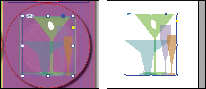 Tip: To show only the Art3
layer and hide all other layers, Alt-click (Windows) or
Option-click (macOS) the Toggle Visibility icon for the Art3 layer
in the Layers panel.
Tip: To show only the Art3
layer and hide all other layers, Alt-click (Windows) or
Option-click (macOS) the Toggle Visibility icon for the Art3 layer
in the Layers panel. -
In the Layers panel, click to hide the Art2, Art1, and Background layers so that only the Art3 layer is visible, and you can view the placed image on its own and see the transparent color interactions within the Illustrator image.
-
Click to redisplay the Art2, Art1, and Background layers. Notice that the white “olive” shape is completely opaque, whereas the other shapes of the drinking glasses are partly transparent.
-
With the glasses image still selected, change the Opacity setting in the Effects panel to 60%. Keep the image selected.
-
In the Effects panel, choose Color Burn from the Blending Mode menu. Now the colors and interactions of the image take on a completely different appearance.
-
Choose Edit > Deselect All, and then choose File > Save.
Applying transparency settings to text
Changing the opacity of text is as easy as applying transparency settings to graphic objects in your layout. You’ll try the technique now as you change the color of text.
-
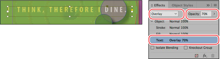
In the Layers panel, lock the Art3 layer, and then unlock the Type layer and make it visible.
-
In the Tools panel, select the Selection tool (
)
and then click the text frame “I THINK, THEREFORE I DINE.” If
necessary, zoom in so that you can read the text easily.To apply transparency settings to text or to a text frame and its contents, you must select the frame with the Selection tool. You cannot specify transparency settings when text is selected with the Type tool.
-
In the Effects panel, select the Text level so that any opacity and blending mode changes you make will apply to the text only.
-
Choose Overlay from the Blending Mode menu and change the Opacity to 70%.
-
Double-click the Hand tool to fit the page in the window, and then choose Edit > Deselect All.
Now you’ll change the opacity of a text frame’s fill.
-
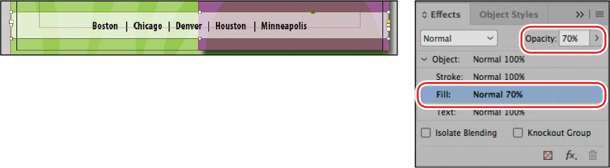
Using the Selection tool (
), click the text frame at
the bottom of the page that contains “Boston | Chicago | Denver |
Houston | Minneapolis.” If necessary, zoom in so that you can read
the text easily. -
Select the Fill level in the Effects panel and change Opacity to 70%. Notice that this changes the white background while the text remains black.
-
Try the same effect with the Object level selected, and notice how this time the text turns gray as well, which is not what we want. This demonstrates the advantage of the ability to apply effects to different parts of the same object. Choose Edit > Undo Set Transparency Parameters.
-
Choose Edit > Deselect All, and then choose File > Save.
Working with effects
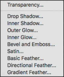
So far in this lesson, you’ve learned how to apply transparency by changing the blending mode and the opacity of objects drawn in InDesign, imported graphics, and text. Another way to apply transparency is by using the nine transparency effects in InDesign. Many of the settings and options for creating these effects are similar.
Transparency effects
You’ll try some of these effects now, as you fine-tune the menu’s artwork.
Applying a basic feather to the edges of an image
Feathering is another way to apply transparency to an object. Feathering creates a subtle transition from opaque to transparent around the edge of an object so that any underlying object or the page background is visible through the feathered area. InDesign features three types of feathering:
-
Basic Feather softens or fades the edges of an object over a distance that you specify.
-
Directional Feather softens the edges of an object by fading the edges to transparent from directions that you specify.
-
Gradient Feather softens the areas of an object by fading them to transparent.
First, you’ll apply Basic Feather, and then you’ll move on to Gradient Feather.
-
In the Layers panel, unlock the Art1 layer if it’s locked.
-
If necessary, choose View > Fit Page In Window to see the entire page.
-
Select the Selection tool (
), and then select the
Light Purple–filled circle on the left side of the page. -
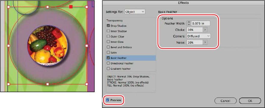
Choose Object > Effects > Basic Feather. The Effects dialog box appears, displaying a list of the transparency effects on the left and an accompanying set of controls on the right.
-
In the Options section of the Effects dialog box, set these options:
-
In the Feather Width box, type 0.375 in.
-
Change both the Choke value and Noise value to 10%.
-
Leave the Corners option set at Diffused.
-
-
Make sure that Preview is selected and, if necessary, move the dialog box to view the effects of your changes. Notice how the edges of the purple circle are now blurred.
-
Click OK to apply the settings, and close the Effects dialog box.
-
Choose File > Save.
Applying a gradient feather
You can use the Gradient Feather effect to fade an object from opaque to transparent.
Note: In addition to applying
transparency effects by choosing Object > Effects and then
choosing an option from the submenu, you can add effects from the
Effects panel menu, or you can click the FX button at the bottom of
the Effects panel and then choose an option from the submenu.
-
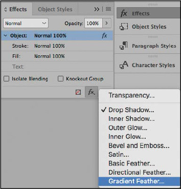
Using the Selection tool (
), click the Light
Purple–filled vertical rectangle that covers the right half of the
page. -
At the bottom of the Effects panel, click the FX button (
 ) and choose Gradient Feather from the
menu.
) and choose Gradient Feather from the
menu.The Effects dialog box appears, displaying Gradient Feather options.
-
In the Gradient Stops section of the Effects dialog box, click the Reverse Gradient button (
 ) to reverse the solid
and transparent colors.
) to reverse the solid
and transparent colors.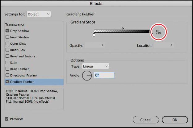
-
Click OK. The purple rectangle should fade to transparent from right to left.
Now you will use the Gradient Feather tool to adjust the direction of the fade.
-
In the Tools panel, select the Gradient Feather tool (
 ). (Be careful not to choose the Gradient
Swatch tool.) Hold down the Shift key, and drag the pointer from
the bottom to the top of the Light Purple rectangle to change the
gradient direction. The Shift key constrains the direction to
exactly vertical.
). (Be careful not to choose the Gradient
Swatch tool.) Hold down the Shift key, and drag the pointer from
the bottom to the top of the Light Purple rectangle to change the
gradient direction. The Shift key constrains the direction to
exactly vertical.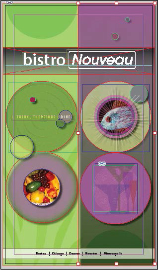
-
Choose Edit > Deselect All, and then choose File > Save.
Next, you will apply multiple effects to a single object and then edit them.
Adding a drop shadow to text
When you add a drop shadow to an object, the result is a 3D effect that makes the object appear to float above the page and cast a shadow on the page and objects below. You can add a drop shadow to any object, and you have the option to assign a shadow independently to an object’s stroke or fill or to the text within a text frame.
Note: The Effects dialog box
allows you to apply multiple effects to a single object and shows
you which effects are applied to a selected object (indicated by a
check mark on the left side of the dialog box).
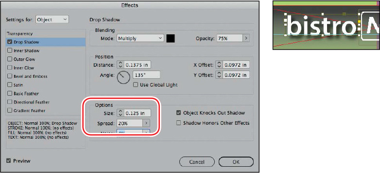
Now you’ll try this technique by adding a drop shadow to the “bistro” text. It’s important to note that effects can only be applied to a whole text frame, not to some of the words within a frame.
-
Using the Selection tool (
), select the text frame
that contains the word “bistro.” Hold down the Z key to temporarily
access the Zoom tool, or select the Zoom tool ( ) and magnify the frame so
that you can see the text clearly.
) and magnify the frame so
that you can see the text clearly. -
At the bottom of the Effects panel, click the FX button (
), and choose Drop Shadow from the menu. -
In the Options section of the Effects dialog box, enter 0.125 in for Size and 20% for Spread. Make sure that Preview is selected so that you can see the effects on your page.
You can also adjust the size and angle of a drop shadow with the settings in the Position area, either by typing numbers in the settings or by dragging the line in the angle circle to a new position.
-
Click OK to apply the drop shadow to the text.
-
Choose File > Save to save your work.
Applying multiple effects to an object
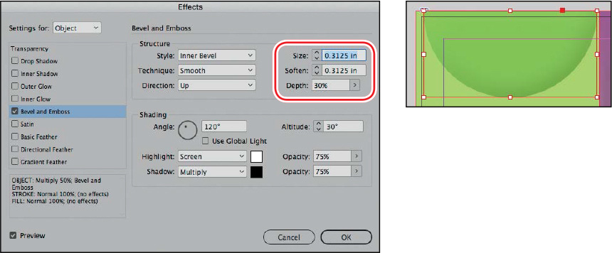
You can apply several different types of transparency effects to an object. For example, you can create the impression that an object is embossed and that it has a glow around it by applying two transparency effects.
In this exercise, you’ll apply an embossed effect and an outer glow effect to the two semicircles on the page.
-
Choose View > Fit Page In Window.
-
Using the Selection tool (
), select the Light
Green–filled semicircle in the upper-left corner of the page. -
At the bottom of the Effects panel, click the FX button (
), and choose Bevel And Emboss from the
menu. -
In the Effects dialog box, make sure that Preview is selected so that you can view the effects on the page. Then specify the following settings in the Structure section:
-
Size: 0.3125 in
-
Soften: 0.3125 in
-
Depth: 30%
-
-
Leave the rest of the settings as they are, and keep the Effects dialog box open.
-
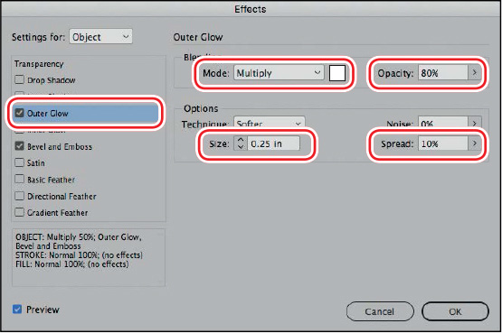
On the left side of the dialog box, click the check box to the left of Outer Glow to add an outer glow effect to the semicircle.
-
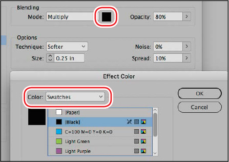
Click the words Outer Glow to edit the effect, and specify these settings:
-
Mode: Multiply
-
Opacity: 80%
-
Size: 0.25 in
-
Spread: 10%
-
-
Click the Set Glow Color box to the right of the Mode menu. In the Effect Color dialog box, make sure that Swatches is selected in the Color menu, choose Black from the list of colors, and then click OK.
-
Click OK to apply the settings for the multiple effects.
Next, you will apply the same effects to the other semicircle on the page, simply by dragging the FX icon from the Effects panel to the semicircle.
Copying effects between objects
-
Double-click the Hand tool (
 ) to fit the page
in the window.
) to fit the page
in the window. -
Using the Selection tool (
), select the green
semicircle in the upper-left corner of the page, if necessary. Tip: You can also open the
Effects dialog box by double-clicking the FX icon to the right of
the Object level in the Effects panel. -
With the Effects panel open, drag the FX icon (
)
on the right side of the Object level to the page and directly on
top of the green semicircle in the lower-right corner.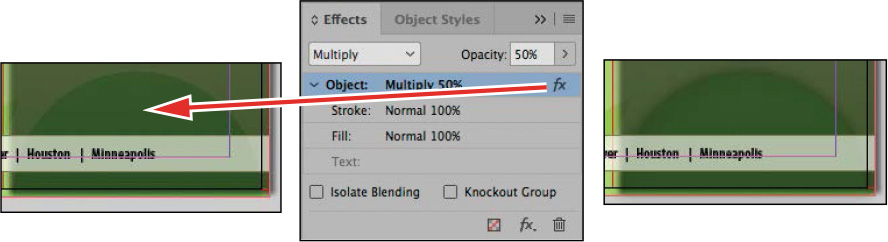
Dragging the FX icon onto the semicircle (left and center) yields the result seen here (right).
Now you will apply the same effects to the small gray circle on the page.
-
In the Layers panel, click the eye icon (
) to
turn off the visibility for the Art3 layer, and then unlock the
Art2 layer. -
Make sure the green semicircle in the upper-left corner of the page is still selected. Drag the FX icon (
) from
the Effects panel onto the small gray circle above and to the right
of the fish image. -
Choose File > Save.
You can also use this same technique to apply effects to objects in other documents.
-
Go to File > Open and open the file 12_Start.indd again.
-
Go to Window > Arrange > Tile so that you can see both files side by side.
-
In the file 12_Start.indd, navigate to page 2 and then make sure that the Background layer is active (since it is already unlocked).
-
Draw a shape, such as a rectangle or ellipse frame, with one of the drawing tools, and choose a color for the fill from the Swatches panel.
-
Click back on the 12_Menu.indd file and select the Light Green–filled semicircle in the upper-left corner of the page, which now has multiple effects applied.
-
Use the same technique as in step 3 of the previous procedure: With the Effects panel open, drag the FX icon (
) on
the right side of the Object level, and drop it directly on top of
the shape you just drew.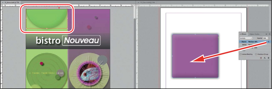
-
Close the 12_Start.indd file without saving.
Another way to apply effects to other objects is to create an object style, as you learned in Lesson 9.
Editing and removing effects
Applied effects can easily be edited or removed. You can also quickly check whether any effects have been applied to an object.
First you’ll edit the gradient fill behind the restaurant title, and then you’ll remove the effects applied to one of the circles.
Tip: To quickly see which
pages in your document contain transparency, choose Panel Options
from the Pages panel menu, and then select Transparency. A small
icon ( )
is displayed next to any pages containing transparency.
)
is displayed next to any pages containing transparency.
-
In the Layers panel, make sure that the Art1 layer is unlocked and that it is visible.
-
Using the Selection tool (
), click the frame with the
gradient fill that’s behind the text “bistro Nouveau.” -
With the Effects panel open, click the FX button (
) at the bottom of the panel. In the menu
that appears, the Gradient Feather effect has a check mark next to
it, which indicates that it is already applied to the selected
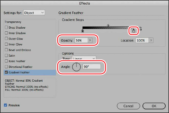
object. Choose the Gradient Feather option from the menu.When not to use transparency
 Tip: If you like to use the
sliding function of the Opacity slider to see a color change before
making a choice, note that you can also use the same slider
functionality in the Color panel to create a tint. The only
difference is that you must release the mouse as you move along the
slider to see the change.
Tip: If you like to use the
sliding function of the Opacity slider to see a color change before
making a choice, note that you can also use the same slider
functionality in the Color panel to create a tint. The only
difference is that you must release the mouse as you move along the
slider to see the change.
-
In the Effects dialog box, under Gradient Stops, click the color stop (the small white square) at the right end of the gradient ramp. Change the Opacity to 30%, and change the Angle to 90°.
-
Click OK to update the Gradient Feather effect.
Now you will remove all of the effects applied to an object.
Tip: When you hold down the
Ctrl key (Windows) or Command key (macOS) and click overlapping
objects, the first click selects the topmost object, and each
successive click selects the next object below in the stacking
order. -
In the Layers panel, turn on visibility for all layers and unlock all layers.
-
Select the Selection tool (
). While holding down the
Ctrl key (Windows) or Command key (macOS), click the small gray
circle to the right and above the fish image on the right side of
the page. Your first click will select the rectangular frame above
the circle. Click again within the small circle to select it. Note: The Clear Effects
button also removes blending mode and opacity setting changes from
the object. -
At the bottom of the Effects panel, click the Clear Effects button (
 ) to remove the Drop Shadow effect applied
to the circle.
) to remove the Drop Shadow effect applied
to the circle.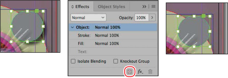
-
Choose File > Save.
Congratulations! You have completed the lesson.
Exploring on your own
Try some of the following ways of working with InDesign transparency options:
-
Scroll to a blank area of the pasteboard and create some shapes (by using the drawing tools or by importing new copies of some of the image files used in this lesson) on a new layer. Apply fill colors to any shapes that don’t have content, and position your shapes so that they overlap each other, at least partially. Then:
-
Select the uppermost object in your arrangement of shapes. Using the controls in the Effects panel, experiment with other blending modes, such as Luminosity, Hard Light, and Difference. Then select a different object and choose the same blending modes in the Effects panel to compare the results. When you have a sense of what the various modes do, select all of your objects, and choose Normal as the blending mode.
-
In the Effects panel, change the Opacity value of some of the objects but not others. Then select different objects in your arrangement and use the Object > Arrange > Send Backward and Object > Arrange > Bring Forward commands to observe different results.
-
Experiment with combinations of different opacities and different blending modes applied to an object. Do the same with other objects that partially overlap the first object to explore the variety of effects you can create.
-
-
In the Pages panel, double-click page 1 to center it in the document window. Open the Layers panel and then click the eye icon for the different Art layers one at a time to see the differences this creates in the overall effect of the layout.
-
In the Layers panel, make sure that all the layers are unlocked. In the layout, click the image of the glasses to select it. Use the Effects panel to apply a drop shadow.