7 Working with Typography
Lesson Overview
In this lesson, you’ll learn how to do the following:
-
Customize and use the baseline grid.
-
Adjust vertical and horizontal text spacing.
-
Change fonts and type styles.
-
Insert special characters from OpenType fonts.
-
Create a headline that spans multiple columns.
-
Balance the text in columns.
-
Hang punctuation outside a margin.
-
Add and format a drop cap.
-
Adjust line breaks.
-
Specify a tab with a leader and create a hanging indent.
-
Add a rule and shading to a paragraph.

This lesson will take approximately 60 minutes to complete.
Please log in to your account on peachpit.com to download the lesson files for this chapter, or go to the “Getting Started” section at the beginning of this book and follow the instructions under “Accessing the Lesson Files and Web Edition.” Store the files on your computer in a convenient location.
InDesign offers many features for fine-tuning typography, including drop caps for leading the eye into a paragraph, easy access to OpenType features such as fractions, precision line-spacing and character-spacing controls, and the ability to automatically balance text in columns.
Getting started
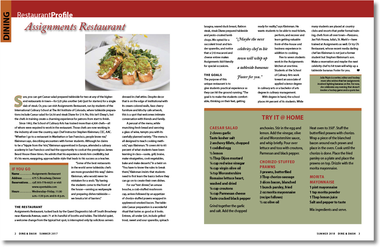
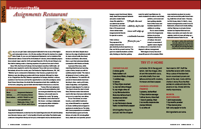
In this lesson, you’ll fine-tune the typography in a restaurant review for a high-end lifestyles magazine. For the rich look of the magazine, the type is precisely spaced and formatted: It uses a baseline grid for aligning text across columns, correctly formatted fractions in the recipes, and decorative touches, such as drop caps and pull quotes.
 Note: If you have not already
downloaded the project files for this lesson to your computer from
your Account page, make sure to do so now. See “Getting Started” at the beginning of the
book.
Note: If you have not already
downloaded the project files for this lesson to your computer from
your Account page, make sure to do so now. See “Getting Started” at the beginning of the
book.
-
To ensure that the preferences and default settings of your Adobe InDesign program match those used in this lesson, move the InDesign Defaults file to a different folder following the procedure in “Saving and restoring the InDesign Defaults file” on pages 4–5.
-
Start Adobe InDesign.
-
The InDesign Start Screen displays. Click Open at left. (If the Start Screen does not display, choose File > Open from the InDesign menu bar.)
-
Open the 07_Start.indd file in the Lesson07 folder, located inside the Lessons folder within the InDesignCIB folder on your hard disk.
-
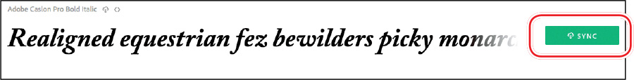
If the Missing Fonts dialog box displays, click Sync Fonts to access any missing fonts through Adobe Typekit. Click Close when font syncing is complete.
Note: For higher contrast in
the printed manual, the screen captures in this book show the
Medium Light interface. Interface elements such as panels and
dialog boxes may be darker on your screen. -
To ensure that the panels and menu commands match those used in this lesson, choose Window > Workspace > [Advanced], and then choose Window > Workspace > Reset Advanced.
-
To display the document at a higher resolution, choose View > Display Performance > High Quality Display (if it’s not already enabled).
-
Choose File > Save As, rename the file 07_Type.indd, and save it in the Lesson07 folder.
-
If you want to see what the finished document looks like, open the 07_End.indd file in the same folder. You can leave this document open to act as a guide as you work.
In this lesson, you will work intensively with text. You can use the character-formatting controls and paragraph-formatting controls in the Control panel, or you can use the Character panel and Paragraph panel. Using the individual Character and Paragraph panels can be easier for formatting text because you can drag the panels to where you want them.
Note: Drag the Paragraph
panel tab into the Character panel tab to create a panel group, if
you prefer. -
Choose Type > Character and Type > Paragraph to open the two primary text-formatting panels. Leave these panels open until you finish this lesson.
-
Choose Type > Show Hidden Characters so you can see spaces, paragraph returns, tabs, and the like while you work on this lesson.
Adjusting vertical spacing
InDesign provides several options for customizing and adjusting the vertical spacing of text in a frame. You can do the following:
-
Set the space between lines of paragraphs using a baseline grid.
-
Set the space between lines using the Leading menu in the Character panel.
-
Set the space between paragraphs using the Space Before and Space After options in the Paragraph panel.
-
Use the Vertical Justification and Balance Columns options in the Text Frame Options dialog box to align text within a frame.
-
Control how paragraphs flow from one column to the next using the Keep Lines Together, Keep With Previous, and Keep With Next settings available in the Keep Options dialog box (choose Keep Options from the Paragraph panel menu).
In this section of the lesson, you will use the baseline grid to align text.
Using the baseline grid to align text
 Tip: You can set up a baseline
grid at the text frame level, which is ideal for situations in
which different stories have different leading values. Choose
Object > Text Frame Options, and then click the Baseline Options
tab.
Tip: You can set up a baseline
grid at the text frame level, which is ideal for situations in
which different stories have different leading values. Choose
Object > Text Frame Options, and then click the Baseline Options
tab.
Once you’ve decided on the font size and leading for your document’s body text, you may want to set up a baseline grid (also called a leading grid) for the entire document. The baseline grid represents the leading (line spacing) for your document’s body text and is used to align the baseline of type in one column of text with the baseline of type in neighboring columns and pages.
Before you set up the baseline grid, you need to check the margin value for the top of your document and the leading value for the body text. These elements work together with the grid to create a cohesive design.
-
To view the top margin value for the page, choose Layout > Margins And Columns. The top margin is set to 6p0 (6 picas, 0 points). Click Cancel.
-
To view the leading value for the body text, select the Type tool (
 ) in the Tools panel. Click to place an
insertion point in the first full paragraph of the story, which
starts with “Sure.” Look at the leading value (
) in the Tools panel. Click to place an
insertion point in the first full paragraph of the story, which
starts with “Sure.” Look at the leading value ( ) in the Character panel.
The leading is set to 14 pt (14 points).
) in the Character panel.
The leading is set to 14 pt (14 points). -
Choose Edit > Preferences > Grids (Windows) or InDesign CC > Preferences > Grids (macOS) to set the baseline grid options.
-
In the Baseline Grid section, type 6p in the Start box to match your top margin setting of 6p0.
This option sets the location of the first grid line for the document. If you use the default value of 3p0, the first grid line would appear above the top margin.
-
In the Increment Every box, type 14 pt to match the leading.
Tip: By customizing the View
Threshold value, you can view the grid while zoomed in to edit text
but have it hidden while you zoom out and view the whole page. -
Choose 100% from the View Threshold menu.
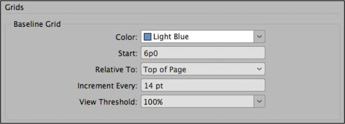
The View Threshold menu sets the minimum zoom level at which you can see the grid onscreen. When this setting is 100%, the grid appears in the document window only at magnifications of 100% or higher.
-
Click OK.
-
Choose File > Save.
Viewing the baseline grid
Now you’ll make the new grid visible onscreen.
-
To view the baseline grid in the document window, choose View > Grids & Guides > Show Baseline Grid, and then choose View > Actual Size.
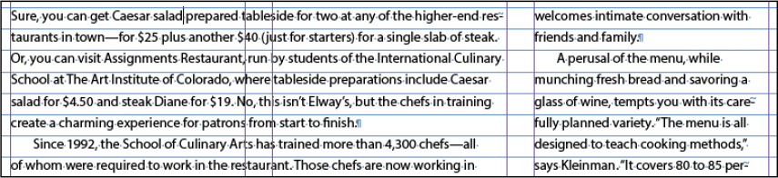
You can align one paragraph, selected paragraphs, or all the paragraphs in a story to the baseline grid. (A story is all the text in a series of threaded text frames.) In the following steps, you will use the Paragraph panel to align the main story to the baseline grid.
-
Using the Type tool (
), click to place an
insertion point anywhere in the first paragraph on the spread, and
then choose Edit > Select All to select all the text in the main
story. -
If the Paragraph panel isn’t visible, choose Type > Paragraph.
If necessary, choose Show Options from the Paragraph panel menu to see all the options.
Tip: As with most other
paragraph-formatting controls, the baseline grid controls are also
available on the Control panel. -
In the Paragraph panel, click Align To Baseline Grid (
 ). The text shifts so that the
baselines of the characters rest on the grid lines.
). The text shifts so that the
baselines of the characters rest on the grid lines.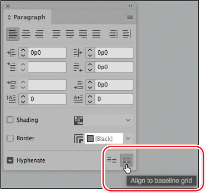
-
Click the pasteboard to deselect the text. Choose File > Save.
Changing the spacing between paragraphs
Tip: When applying paragraph
attributes, it isn’t necessary to select an entire paragraph with
the Type tool. Just select part of the paragraph or paragraphs you
want to format. If you are formatting only one paragraph, you can
simply click in the paragraph to place an insertion point.
When you apply space before or after a paragraph aligned to the baseline grid, the space before/after values are ignored, and the first line of the paragraph is placed on the next baseline grid line. For example, if you apply Space Before (greater than 0 and less than 14 pt) to a paragraph aligned to a 14-pt baseline grid, the paragraph will automatically start on the next available baseline. If you apply Space After, the following paragraph will automatically jump to the next available baseline. This creates a 14-pt space between the paragraphs.
Here, you’ll make the subheads in the main story stand out more by inserting space before (above) them. Then, you’ll update the Subhead paragraph style to automatically apply the new spacing to all the subheads.
-
Choose View > Fit Spread In Window to see the full-page spread.
-
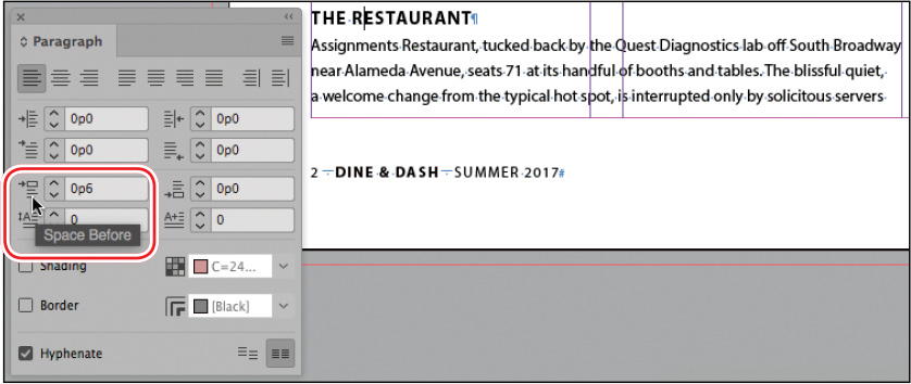
Using the Type tool (
), click anywhere in the
subhead “THE RESTAURANT” on the left
page. -
In the Paragraph panel, type 6 pt in the Space Before box (
 ), and press Enter or
Return.
), and press Enter or
Return.The points are automatically converted to picas, and the text in the subhead shifts automatically to the next grid line.
-
Click Paragraph Styles in the list of docked panels at right.
-
With the insertion point still in the “The Restaurant” subhead, notice that a plus sign (+) appears after the Subhead style name in the panel.
This sign indicates that the formatting of the selected text has been modified from the original formatting of the applied paragraph style. Differences between a style and actual formatting are referred to as “overrides.”
Tip: If you’re working on a
redesign of a publication, often you will experiment with
already-formatted text. The ability to redefine styles makes it
easy to save new specifications in styles that are then saved with
updated templates. -
Choose Redefine Style from the Paragraph Styles panel menu. The Subhead style takes on the formatting—specifically, the new Space Before setting and the Align To Baseline Grid setting—of the selected paragraph.
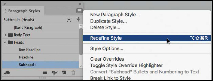
Notice that the plus sign (+) no longer appears after the style name and that space is added above the “The Goals” subhead on the right page as well.
Tip: You can also choose
Baseline Grid from the View Options menu on the Application bar to
view and hide the baseline grid. -
Choose View > Grids & Guides > Hide Baseline Grid.
-
Choose Edit > Deselect All.
-
Choose File > Save.
Working with fonts, type styles, and glyphs
Changing the fonts and type styles of text can make a dramatic difference in the appearance of your document. InDesign automatically installs a few fonts, including several styles of Letter Gothic and Myriad Pro. Creative Cloud members can access additional fonts through the Adobe Typekit website, which offers select fonts for free and others for licensing. Once a font is installed, you can apply it to text and change its size, select a style (such as bold or italic), and more. In addition, you can access all the glyphs (every form of each character) in the font.
Adding a font from Adobe Typekit
This exercise uses Adobe Caslon Pro Bold Italic, which is available for free from the Adobe Typekit website. If the font is already installed on your system, follow the steps to see how you can add another font.
Tip: Each style of a font,
such as bold or italic, is actually installed as a different font
file on your system.
-
Choose Type > Add Fonts From Typekit. This launches your preferred browser and takes you to https://typekit.com.
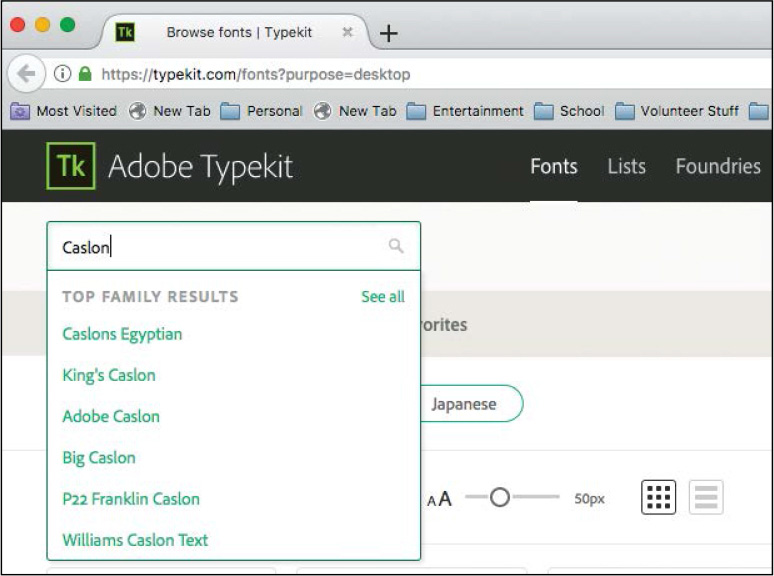
-
Click in the Search box at the top of the screen, type Caslon, and press Enter or Return.
-
When the search results display, click Adobe Caslon.
-
Scroll down to locate Adobe Caslon Pro Bold Italic and, if necessary, click Sync.
-
Switch back to InDesign.
Applying a font, style, size, and leading
Here, you’ll use the Font Similarity feature to apply a different font to the headline. Then, you’ll change the font family, style, size, and leading for the text in the pull quote on the right page. A pull quote is an interesting quote copied from the main text and formatted in an eye-catching way to draw readers into an article.
Tip: The Font Similarity
feature lets you quickly experiment with different fonts with
similar characteristics.
-
Using the Type tool (
), select the story
headline, “Assignments Restaurant,” at the top of the left
page. -
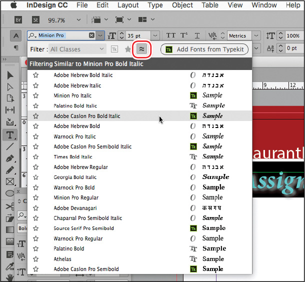
Click the Font menu on the Control panel or on the Character panel. Click Show Similar Fonts above the menu.
InDesign filters the Font menu to show typefaces similar to the current font, Minion Pro Bold Italic.
-
Select the font you synced from Adobe Typekit: Adobe Caslon Pro Bold Italic.
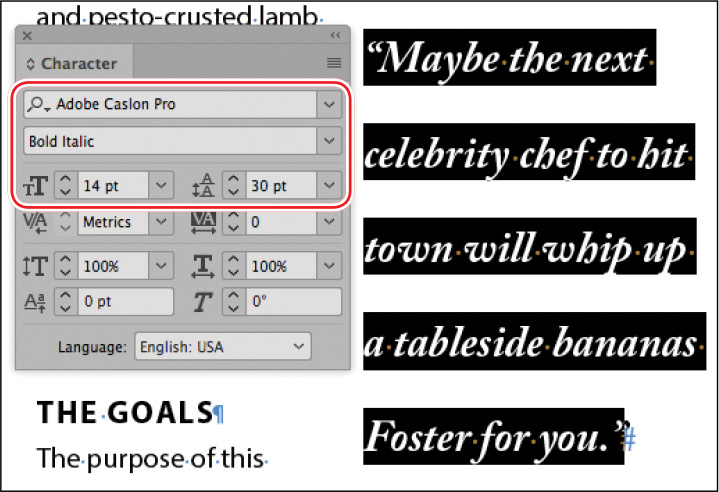
Now you will work on the pull quote starting with “Maybe the next celebrity chef” on the right page.
-
Zoom in on the pull quote, and choose View > Hide Guides to better concentrate on the text.
-
If the Character panel isn’t visible, choose Type > Character.
-
Using the Type tool (
), click inside the pull
quote’s text frame. To select the entire paragraph, quadruple-click
(click four times rapidly). Tip: To quickly select a font,
you can type the first few letters in the Font Name field until it
is recognized. -
In the Character panel, set the following options:
-
Font: Adobe Caslon Pro (alphabetized under “C”)
-
Style: Bold Italic
-
Size: 14 pt
-
Leading: 30 pt
-
-
Choose Edit > Deselect All.
-
Choose File > Save.
Finding fonts
-
Name Search: A quick way to find a font is to start typing the font name in the Font box. For example, as you type “Cas” for Adobe Caslon Pro, all fonts with those three characters in it are listed. By default, InDesign searches by the entire font name. You can click the search icon (
 ) to the left of the font name to search
by first word only. In that case, you would need to type “Adobe
Cas” for the same result.
) to the left of the font name to search
by first word only. In that case, you would need to type “Adobe
Cas” for the same result. -
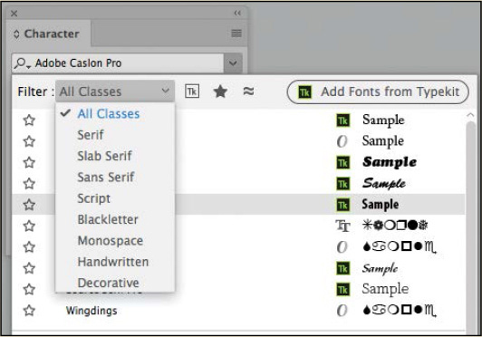
Filter by Class: Select a font class from the Filter menu, such as Serif or Script.
-
Favorites: For quick access to fonts you use frequently, click the star to the left of a font name in any Font menu. Then, click Apply Favorite Filter (
 ) at the top of the menu.
 -
Font Similarity: Click Show Similar Fonts to filter the Font menu to display fonts visually similar to the current font.
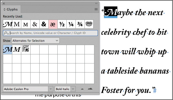
Replacing a character with an alternate glyph
Tip: The Glyphs panel features
many controls for filtering the options available within a
font—such as Punctuation or Ornaments. Some fonts may have hundreds
of alternates available, while others will have only a few.
Because Adobe Caslon Pro is an OpenType font, which typically provides multiple glyphs for standard characters, you can select alternatives for many characters. A glyph is a specific form of a character. For example, in certain fonts, the capital letter “A” is available in several forms, such as small cap. You can use the Glyphs panel to select alternatives and locate any glyph in a font. In addition, InDesign offers an on-the-fly method for replacing a glyph. You will try both methods here.
-
Using the Type tool (
), select the first “M” in
the pull quote. -
Choose Type > Glyphs.
-
In the Glyphs panel, choose Alternates For Selection from the Show menu to see the alternate glyphs available. Depending on the active version of Adobe Caslon Pro, your options may look different.
Tip: From the Character panel
menu, choose the OpenType option. Options in the OpenType menu
displayed in brackets are not available for the selected font. -
Double-click the more script-like “M” to replace the original character.
If alternate glyphs, or other OpenType features, are available for the combination of selected characters, InDesign displays a small menu that lets you select from OpenType glyph options.
-
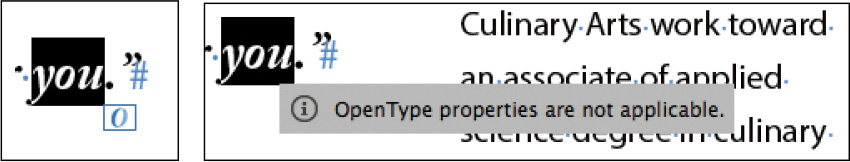
Select the last word in the pull quote, “you,” to see the OpenType badge. If you click this badge, it indicates OpenType Properties Are Not Applicable.
-
In the last line of the pull quote, select the letter “F” in “Foster.” A blue highlight appears below the selected character and a contextual menu displays the OpenType glyph. Click the “F” in the menu to replace the existing “F.”

-
Choose Edit > Deselect All.
-
Choose File > Save.
Adding a special character
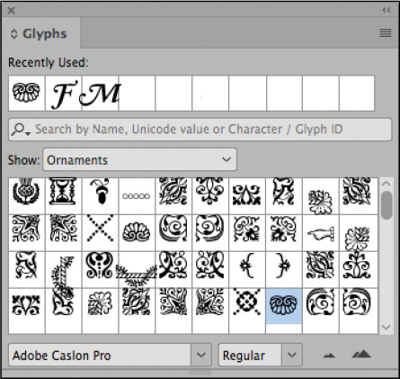
Now you’ll add a right-indent tab followed by a decorative font character to the end of the story—also known as an “end-of-story character.” This lets the reader know that the story is finished.
Tip: You can access some of
the more commonly used glyphs, such as the copyright and trademark
symbols, in the Type menu (Insert Special Character > Symbols)
and the context menu. To access the context menu, right-click
(Windows) or Control-click (macOS) at the insertion point.
-
Scroll or zoom to see the last body paragraph of the story, ending with the words “bananas Foster for you.”
-
Using the Type tool (
), click to place an
insertion point in the last paragraph, just after the final
period. -
If the Glyphs panel is not open, choose Type > Glyphs.
You can use the Glyphs panel to view and insert OpenType attributes, such as ornaments, swashes, fractions, and ligatures.
-
At the bottom of the panel, delete the name of the selected font. Type the first few letters of “Adobe Caslon Pro” until the font is recognized. Press Enter or Return to select the font.
-
In the Glyphs panel, choose Ornaments from the Show menu.
-
From the scrollable list, select any decorative character you prefer and double-click to insert it. The character appears at the insertion point in the document.
-
Using the Type tool, click to place an insertion point between the final period and the decorative character.
Tip: To quickly insert a
right-indent tab, press Shift+Tab. -
Right-click (Windows) or Control-click (macOS) to display the context menu, and choose Insert Special Character > Other > Right Indent Tab.

-
Choose File > Save.
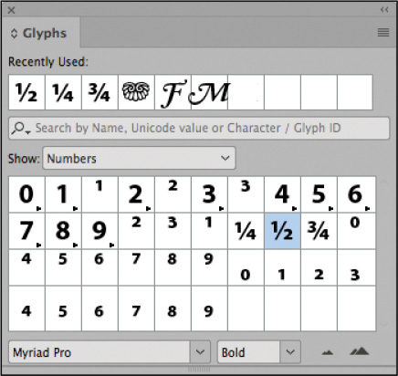
Inserting fraction characters
Tip: If you are working on a
cookbook or other document that requires a variety of fractions,
the fractions built into most fonts will not cover all the values
you need. You will need to research numerator and denominator
formatting options, which are available in some OpenType fonts, or
purchase a specific fraction font.
The recipes in this article do not use actual fraction characters—rather, the 1/2 is built with a numeral 1, a slash, and a numeral 2. Most fonts contain individual characters for common fractions such as ½, ¼, and ¾. When available, these elegant fractions look much more professional than using numerals and slashes.
-
Scroll to the recipes at the bottom of the right-facing page and zoom as necessary to see the fractions in the recipe.
-
Using the Type tool (
), select the first
instance of 1/2 (“1/2 lemon” in the Caesar Salad recipe). -
If the Glyphs panel is not open, choose Type > Glyphs.
-
Choose Numbers from the Show menu.
-
Locate the ½ fraction. If necessary, resize the panel and scroll to see more characters.
-
Double-click the ½ fraction to replace the selected 1/2 in the text.
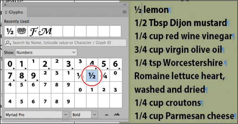
Notice that the ½ fraction is stored in the Recently Used boxes at the top of the Glyphs panel. Now you’ll change instances of the 1/4 and 3/4 fractions.
-
In the Caesar Salad recipe, locate and select 1/4 (“1/4 cup red wine vinegar”).
-
In the Glyphs panel, locate and double-click the ¼ fraction.
-
Repeat the steps above, locating and selecting 3/4 (“3/4 cup virgin olive oil”) and replacing it with the ¾ fraction in the Glyphs panel.
-
If you want, replace the remaining instances of 1/2 and 1/4 in the recipes by selecting the text and double-clicking the respective glyphs in the Recently Used boxes or selecting from the OpenType badge next to the characters.
-
Close the Glyphs panel, and choose Edit > Deselect All.
-
Choose View > Grids & Guides > Show Guides.
-
Choose File > Save.
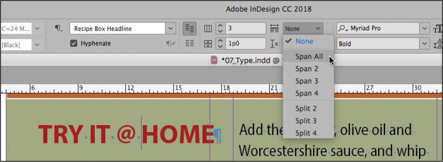
Fine-tuning columns
In addition to adjusting the number of columns in a text frame, the width of the columns, and the space between them, you can create a headline that spans multiple columns (also known as a “straddle head”) and automatically balance the amount of text across the columns.
Creating a straddle head
The headline for the sidebar box needs to span the three columns. You can do this with a paragraph format rather than by placing the headline in its own text frame.
-
If necessary, zoom out to see the entire sidebar containing the recipes.
-
Using the Type tool (
), click in the “TRY IT @
HOME” headline. -
Click the Paragraph Formatting Controls icon (
 ) in
the Control panel. Tip: You can also access the
Span Columns controls in the Paragraph panel menu.
) in
the Control panel. Tip: You can also access the
Span Columns controls in the Paragraph panel menu. -
Locate the Span Columns menu in the Control panel. Select Span All from the menu.
 Tip: You can open the Span
Columns dialog box by selecting Span Columns from the Paragraph
panel menu or the Control panel menu.
Tip: You can open the Span
Columns dialog box by selecting Span Columns from the Paragraph
panel menu or the Control panel menu. -
To see the controls for fine-tuning how the head spans the columns, Alt-click (Windows) or Option-click (macOS) the Span Columns button on the Control panel (
 ).
). -
Select Preview and then experiment with any of the controls to see how they work. When you’re finished, click Cancel.

-
With the insertion point still in the “TRY IT @ HOME” subhead, choose Redefine Style from the Paragraph Styles panel menu. The Recipe Box Headline style is updated to reflect the Span Columns setting.
-
Choose File > Save.
Balancing columns
Now that the headline is added, you can complete the fine-tuning of the sidebar by balancing the amount of text in each column. You can do this manually by inserting a column break character (Type > Insert Break Character > Column Break). The break characters, however, remain if the text reflows, often forcing text into the wrong column. Instead, you will balance the columns automatically.
-
Choose View > Fit Page In Window to center the second page in the document window.
-
Using the Selection tool (
 ), click to select the text
frame containing the recipes.
), click to select the text
frame containing the recipes. -
Choose Object > Text Frame Options. In the General tab, in the Columns area, select the Balance Columns box. Click OK.
Note that any Keep With Next and Keep Lines Together settings for the paragraphs are honored when balancing columns.
-
Choose File > Save.
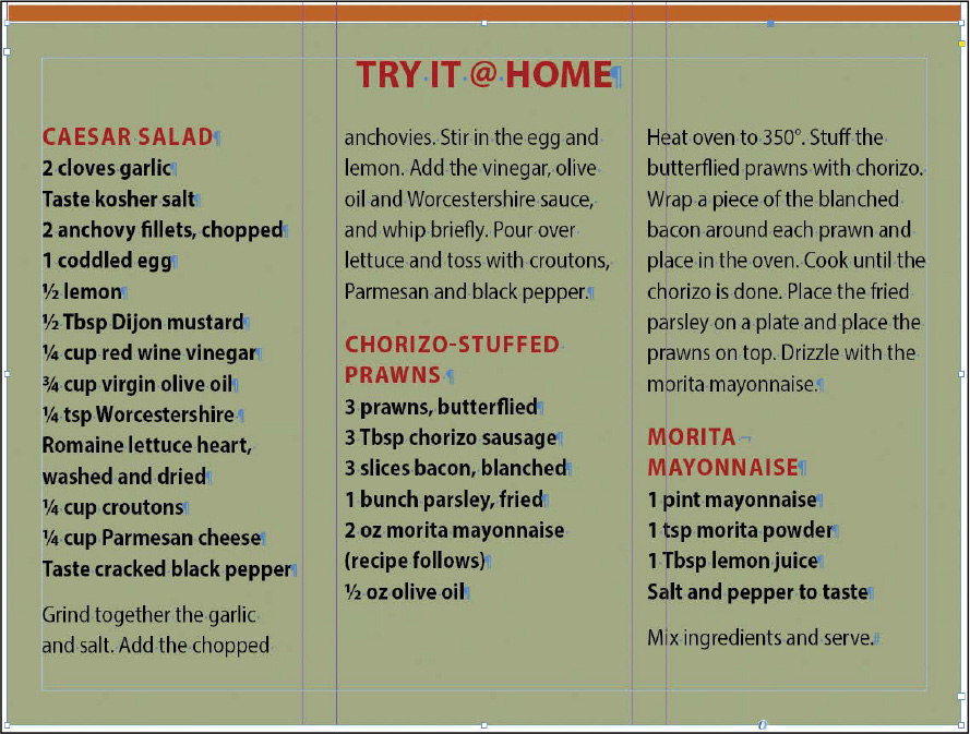
Balanced Columns is set for the sidebar box’s text frame. The paragraphs flow according to the Keep With Next and Keep Lines Together paragraph formats.
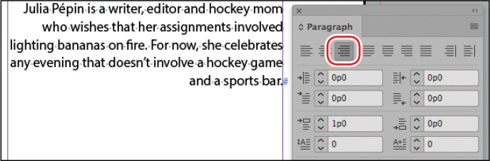
Changing paragraph alignment
You can easily manipulate how a paragraph fits within its text frame by changing the horizontal alignment. You can align text with one or both edges of a text frame, or you can apply inset spacing. In this exercise, you’ll align the author’s biographical information—otherwise known as the “bio”—with the right margin.
-
On the right page, scroll and zoom as necessary to view the author’s bio under the last paragraph of the story.
-
Using the Type tool (
), click to place an
insertion point in the bio text.Because the text in the bio is so small, the line spacing from the baseline grid looks too big. To fix this, you will unlock this paragraph from the grid.
-
With the insertion point still in the bio paragraph, in the Paragraph panel, click Do Not Align To Baseline Grid (
 ).
). -
In the Paragraph panel, click Align Right (
 ).
).
-
Choose Edit > Deselect All.
-
Choose File > Save.
Hanging punctuation outside the margin
Note: When you select Optical
Margin Alignment, it applies to all of the text in a story—defined
as all the text in a frame or a series of threaded text frames.
Sometimes, particularly with punctuation at the beginning and end of lines, margins that are in fact even may appear uneven. To fix this visual discrepancy, designers use optical margin alignment to “hang” punctuation and swashes on characters slightly outside the text frame.
In this exercise, you will apply optical margin alignment to the pull quote.
-
Scroll and zoom as necessary to view the pull quote on the right page.
-
To see how the characters align with the margins, choose View > Extras > Show Frame Edges.
-
Using the Selection tool (
), click to select the text
frame containing the pull quote.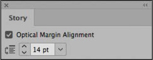
-
Choose Type > Story to open the Story panel.
Tip: When using Optical Margin
Alignment, specifying an Align Based On Size setting that matches
the point size of the text in the frame produces the best
results. -
Select Optical Margin Alignment. Enter 14 pt in the field and press Enter (Windows) or Return (macOS).
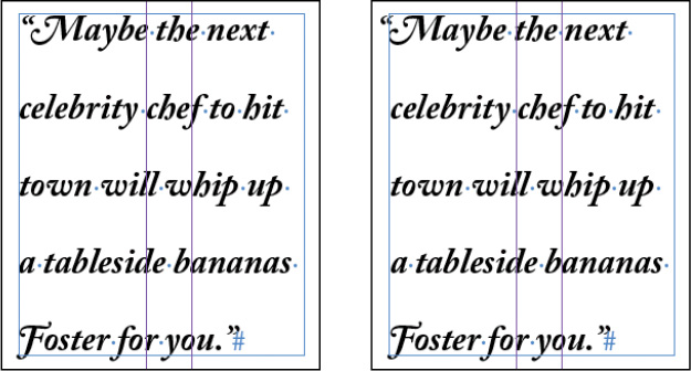
Without (left) and with (right) optical margin alignment. Notice the alignment of the quotation marks. The text looks more visually aligned.
-
Choose View > Extras > Hide Frame Edges. Choose Edit > Deselect All. Choose File > Save.
Creating a drop cap
Tip: Drop caps can be saved
with paragraph styles so you can apply them quickly and
consistently.
You can add creative touches to your document using InDesign typographic features. For example, you can make the first character or word in a paragraph a drop cap, apply a gradient or color fill to text, or create superscript and subscript characters, along with ligatures and old-style numerals. Here, you’ll create a drop cap out of the first character in the first paragraph of the story.
-
Scroll to view the first paragraph in the left page. Using the Type tool (
), click to place an insertion point
anywhere in that paragraph. -
In the Paragraph panel, type 3 in the Drop Cap Number Of Lines box (
 )
to make the letter drop down three lines. Press Enter or
Return.
)
to make the letter drop down three lines. Press Enter or
Return. -
Note the 1 in the Drop Cap One Or More Characters box (
 ) to see how you would increase
the number of characters that drop.
) to see how you would increase
the number of characters that drop.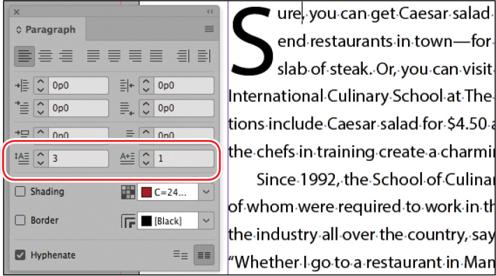
-
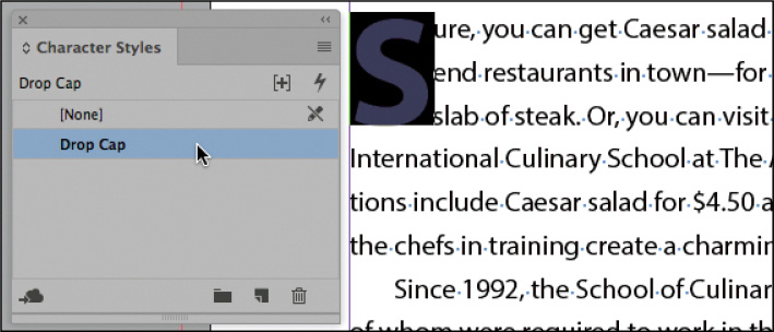
Using the Type tool, select the drop-cap character.
Now, you can apply any character formatting you want.
-
Choose Type > Character Styles to open the Character Styles panel.
Tip: You can create a drop cap
and apply a character style in one step using the Drop Caps And
Nested Styles dialog box (Paragraph panel menu). You can then save
that formatting in a paragraph style. -
Click the Drop Cap style to apply it to the selected text.
-
Click the pasteboard to deselect the text and view the drop cap. Choose File > Save.
Applying a stroke to text
Next, you’ll add a stroke to the drop-cap character you just created.
-
With the Type tool (
) still selected, select the
drop-cap character. -
Choose Window > Stroke. In the Stroke panel, type 1 pt in the Weight box, and press Enter or Return.
A stroke appears around the selected character. Now you’ll change the color of the stroke.
-
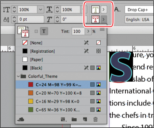
Choose Window > Color > Swatches. In the Swatches panel, do the following:
-
Select the Stroke box (
 ).
). -
Click the rust-colored swatch named C=24 M = 98 Y= 99 K = 18.
-
Type 100 in the Tint field and press Enter or Return.
-
-
Press Shift+Ctrl+A (Windows) or Shift+Command+A (macOS) to deselect the text so that you can view the stroke effect.
-
Choose File > Save.
Adjusting the drop cap alignment
You can adjust the alignment of drop-cap characters as well as scale the size of the drop cap if it has a descender, such as the “tail” on a “y.” In this section, you’ll adjust the drop cap so that it aligns better with the left margin.
Tip: Selecting Align Left Edge
is particularly helpful for better typographical positioning of a
sans serif drop cap.
-
Using the Type tool (
), click to place an insertion
point anywhere in the first paragraph with the drop cap. -
Choose Type > Paragraph. In the Paragraph panel, choose Drop Caps And Nested Styles from the panel menu.
-
Select Preview to view your changes as they occur.
-
Select Align Left Edge to move the drop cap so that it aligns better to the left edge of the text.
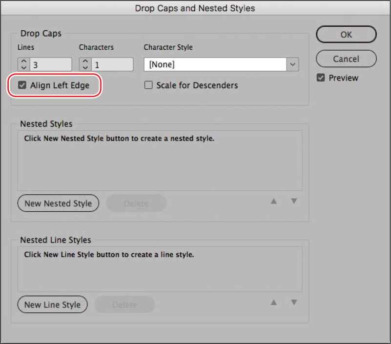
-
Click OK.
-
Choose File > Save.
Adjusting letter and word spacing
You can change the spacing between letters and words using kerning and tracking. You can also control the overall spacing of text in a paragraph by using the Adobe Single-Line Composer and the Adobe Paragraph Composer.
Adjusting the kerning and tracking
By adjusting kerning, you can add or subtract space between specific letter pairs. Tracking increases or decreases spacing across a range of letters. You can use both kerning and tracking on the same text.
Here, you’ll manually kern the space between the drop cap “S” and the remainder of the word, “ure.” Then you’ll track the heading “IF YOU GO” in the box.
-
To see the results of the kerning more clearly, select the Zoom tool (
 ) in the Tools panel, and drag a marquee
around the drop cap.
) in the Tools panel, and drag a marquee
around the drop cap. -
Using the Type tool (
), click to place an
insertion point between the “S” drop cap and the “u” after it. Tip: When you kern text, the
right arrow key adds space and the left arrow key removes space
when combined with the Alt (Windows) or Option (macOS) key. To
change the amount of kerning applied using the shortcuts, you can
edit the Keyboard Increments value in Preferences (Units &
Increments). -
Press Alt+right arrow (Windows) or Option+right arrow (macOS) on the keyboard two times to increase the amount of space between the drop cap and the letter “u.”
The Kerning field (
 ) on the Character panel and
Control panel lets you see and adjust the amount of space between
characters.
) on the Character panel and
Control panel lets you see and adjust the amount of space between
characters.Now you’ll set a tracking value for the entire “If You Go” heading to increase the overall spacing between the letters. To set tracking, you must first select the entire range of characters you want to track.
-
Choose Edit > Deselect All. Scroll down to view the “If You Go” heading in the brown box below the word “Sure.”
-
Using the Type tool, click in “If You Go” three times to select the entire heading.
Note: If you have trouble
selecting the “IF YOU GO” text, first use the Selection tool to
select the text frame. -
In the Character panel, choose 50 from the Tracking menu (
 ).
).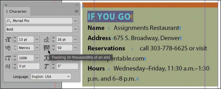
-
Click the pasteboard to deselect the text.
-
Choose View > Fit Spread In Window to see your latest changes.
-
Choose File > Save.
Adjusting line breaks
Tip: For justified text,
Justification settings combine with the Paragraph Composer and
hyphenation settings to control how dense paragraphs look. To
adjust these settings for a selected paragraph, choose
Justification from the Paragraph panel menu.
When text is not justified, the breaks at the end of each line affect readability and impact. For example, when paragraphs are aligned left, the right edge remains ragged. Too much “rag” can make the text easier or harder to read based on many factors, including the font, size, leading, column width, and more. Three other paragraph formats affect the readability of the text:
-
The Adobe Paragraph Composer, which automatically determines line breaks
-
Hyphenation settings, such as whether to hyphenate capitalized words
-
The Balance Ragged Lines feature
Typically, a graphic designer will experiment with a combination of settings until a few paragraphs of sample text look just right. Then, all these options can be saved in paragraph styles and applied with one click. The body paragraph styles used in the lesson document use the Adobe Paragraph Composer and fine-tuned hyphenation settings, so you will only compare the Composers and then apply the Balanced Ragged Lines feature.
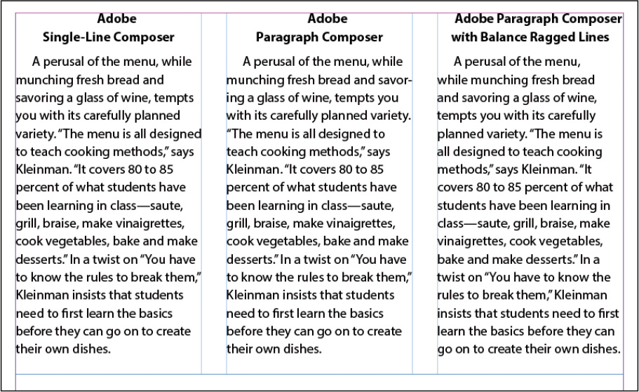
Note the difference in line breaks with successive applications of line break methods. The first column shows a paragraph with the Adobe Single-Line Composer applied. The middle column shows the same paragraph with the Adobe Paragraph Composer applied. As you can see, the right edge is much less ragged. The column on the right shows the paragraph with both Adobe Paragraph Composer and Balance Ragged Lines applied, which helps balance the length of the last line of the paragraph.
Applying the Adobe Paragraph and Single-Line Composers
Note: The Adobe World-Ready
Single-Line Composer and the Adobe World-Ready Paragraph Composer
are intended for use with Middle Eastern languages. With these
composers, you can enter text in a combination of Arabic, Hebrew,
English, French, German, Russian, and other Latin languages.
The density of a paragraph (sometimes called its color) is determined by the composition method used. InDesign’s composition methods consider the word spacing, letter spacing, glyph scaling, and hyphenation options you’ve selected and then determine the best line breaks. InDesign provides two options for composing text: the Adobe Paragraph Composer, which examines all of the lines in a paragraph before composing each line, and the Adobe Single-Line Composer, which composes text one line at a time starting with the first line.
When you use the Paragraph Composer, InDesign composes a line while considering the impact on other lines in the paragraph to set the best overall arrangement of the paragraph. As you change type in a given line, previous and subsequent lines in the same paragraph may break differently, making the overall paragraph appear more evenly spaced. When you use the Single-Line Composer, which is the standard for other layout and word-processing software, InDesign recomposes only the lines following the edited text.
Tip: As a last resort, you can
adjust line breaks manually by inserting the Forced Line Break
(Shift+Return) character or a Discretionary Line Break character at
the end of a line. Both characters are available in the Type >
Insert Break Character submenu. Because the line break characters
remain as text reflows, it’s best to add them when the text and
formatting are final.
The text in this lesson was composed using the default, the Adobe Paragraph Composer. To see the difference between the two, you’ll recompose the body text using the Adobe Single-Line Composer.
-
Using the Type tool (
), click to place an
insertion point anywhere in the main story. -
Choose Edit > Select All.
-
In the Paragraph panel, choose Adobe Single-Line Composer from the panel menu. If necessary, increase the view scale to see the difference.
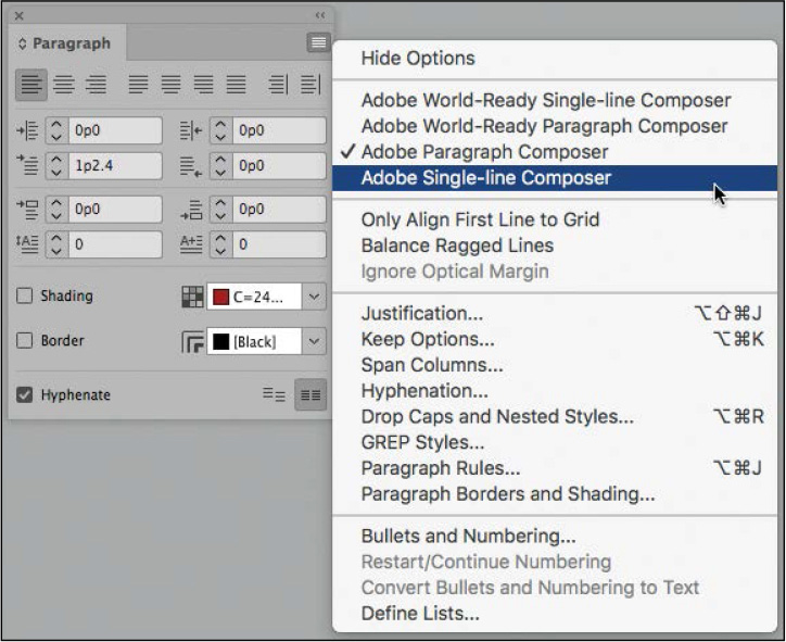
The Single-Line Composer handles each line individually. As a result, some lines in a paragraph appear denser or more sparse than others. Because the Paragraph Composer looks at multiple lines at once, it makes the density of the lines in a paragraph more consistent.
-
Click a blank area of the page to deselect the text, and view the different spacing and line endings.
-
To restore the story to the Adobe Paragraph Composer, choose Edit > Undo.
-
Choose Edit > Deselect All.
Hyphenation settings
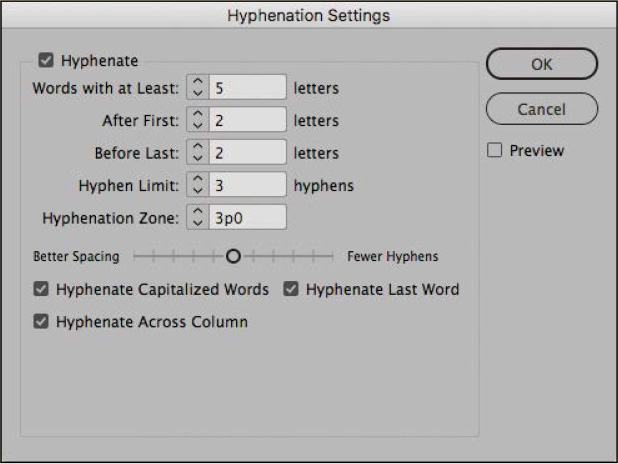
-
Hyphenation Settings: To customize hyphenation for selected paragraphs, choose Hyphenation from the Paragraph panel menu. You can also adjust hyphenation settings in the Paragraph Style Options dialog box.
-
Toggle hyphenation: When you’re editing text, you can use the Hyphenate check box on the Control panel or Paragraph panel to quickly enable and disable hyphenation for selected paragraphs.
-
Customize hyphenation: You may have specific words, such as trademarked words, that you prefer not to hyphenate or to hyphenate at specific points. You can specify the preferred hyphenation in Edit > Spelling > User Dictionary.
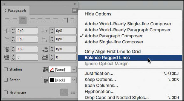
Balancing ragged lines
Tip: The Balance Ragged Lines
feature also works well for balancing multi-line headlines.
When paragraphs are not justified, the line endings can sometimes look too ragged, with some lines much longer or shorter than others. Using the Adobe Paragraph Composer and adjusting hyphenation can help, as can the Balance Ragged Lines feature. You will apply that here.
-
Using the Type tool (
), click to place an
insertion point anywhere in the author’s bio. (The bio, which
starts with “Julia Pépin,” is on the right page in the last
paragraph of the last column.) -
In the Paragraph panel, choose Balance Ragged Lines from the panel menu.
-
Choose Edit > Deselect All.
-
Choose File > Save.
Setting tabs
Tip: When working with tabs,
it helps to view the tab characters by choosing Type > Show
Hidden Characters. It is common to receive word-processing files in
which the writer or editor has entered multiple tabs to align the
text onscreen—or worse, entered spaces rather than tabs. The only
way to see what you’re dealing with (and fix it) is to view hidden
characters.
You can use tabs to position text in specific horizontal locations in a column or frame. In the Tabs panel, you can organize text and create tab leaders, indents, and hanging indents.
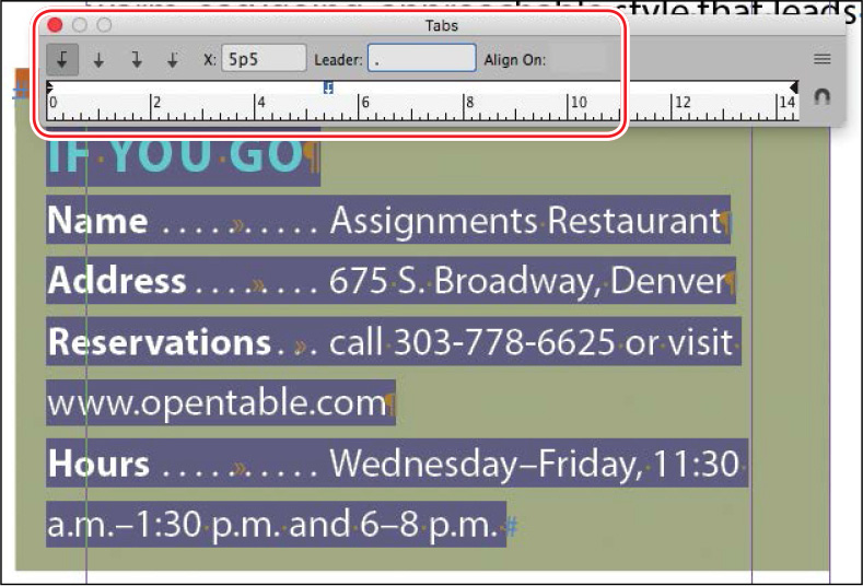
Aligning text to tabs and adding tab leaders
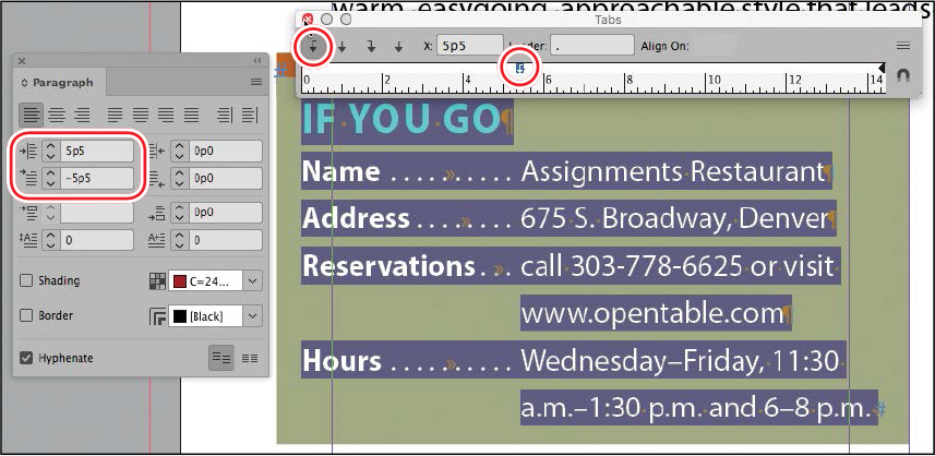
Here, you’ll format the tabbed information in the “If You Go” box on the left page. The tab markers have already been entered in the text, so you will specify the final location of the text.
-
Scroll and zoom as necessary to view the “If You Go” box.
-
To view the tab markers in the text, make sure that hidden characters are showing (Type > Show Hidden Characters) and that Normal Mode (
 ) is selected in the Tools panel.
 -
Using the Type tool (
), click in the “If You Go” box,
and select from the second line (starting with “Name”) to the last
line (ending with “6–8 p.m.).” -
Choose Type > Tabs to open the Tabs panel.
When a text frame has an insertion point and enough space at the top, the Tabs panel snaps to the top of the frame so that the measurements in the panel’s ruler exactly match the text. Regardless of the position of the Tabs panel, you can enter values to set tabs with precision.
-
In the Tabs panel, click Left-Justified Tab (
 ).
This specifies that text aligns to the left of the tab stop.
).
This specifies that text aligns to the left of the tab stop. -
Type 5p5 in the X (tab stop) box, and press Enter or Return.
The information following each tab marker in the selected text now aligns to the new tab stop, which is positioned just above the ruler in the Tabs panel.
-
With the text still selected and the Tabs panel still open, click the new tab stop in the tab ruler to select it. Type a period (.) and a space in the Leader box.
The Leader box specifies the character or characters that fill the space between the text and the tab stop. Tab leaders are commonly used in tables of contents. Using a space between periods creates a more open dot sequence in the tab leader.
-
Press Enter or Return to apply the tab leader. Leave the Tabs panel open and in position for the next exercise.
-
Choose Edit > Deselect All.
-
Choose File > Save.
Creating a hanging indent
In a “hanging indent,” text before the tab marker hangs to the left—as you will often see in a bulleted or numbered list. To create a hanging indent for the information in the “If You Go” box, you will use the Tabs panel. You can also use the Left Indent and First Line Left Indent boxes in the Paragraph panel.
-
Using the Type tool (
), click in the “If You Go”
box, and select from the second line (starting with “Name”) to the
last line (ending with “6–8 p.m.”). Note: If the Tabs panel has
moved, click its Position Panel Above Text Frame button ( ) at the
right.
) at the
right. -
Make sure that the Tabs panel is still aligned directly above the text frame.
-
In the Tabs panel, drag the bottom indent marker on the left side of the ruler to the right until the X value is 5p5.
Dragging the bottom marker moves both the Left Indent and First Line Indent markers at once. Notice how all the text shifts to the right, and the Left Indent value in the Paragraph panel changes to 5p5.
Keep the text selected. Now you’ll bring just the category headings back to their original location in the frame to create a hanging indent.
Tip: You can also adjust the
first-line indent for selected paragraphs by dragging the top
indent marker on the tab ruler. However, it can be difficult to
select the marker without accidentally creating or modifying a tab
stop. -
In the Paragraph panel, type –5p5 in the First Line Left Indent (
 )
box.
)
box. -
Press Enter or Return to apply the setting.
-
Deselect the text, and view the hanging indent. Close the Tabs panel.
-
Choose File > Save.
Adding a rule above a paragraph
You can add a horizontal rule (line) above or below a paragraph. The advantage of using rules rather than simply drawing a line is that rules can be applied with a paragraph style, and they travel with the paragraph when text reflows. For example, you might use both a rule above and rule below in a paragraph style for pull quotes. Or, you might use a rule above a subhead. Paragraph rules can be the width of the column or the text, as follows:
-
When Width is set to Column, the paragraph rule will have the same length as the text column—minus any paragraph indent settings. To extend a rule beyond the paragraph indents, you can enter negative Left Indent and Right Indent values in the Paragraph Rules dialog box.
-
When Width is set to Text, the paragraph rule will have the same length as the line of text to which it applies. For Rule Above, that is the first line of a multi-line paragraph; for Rule Below, it’s the last line of the paragraph.
Here you’ll add a rule above the author bio at the end of the story.
-
Scroll to view the third column on the right page, which contains the author bio.
-
Using the Type tool (
), click to place an
insertion point in the author bio. -
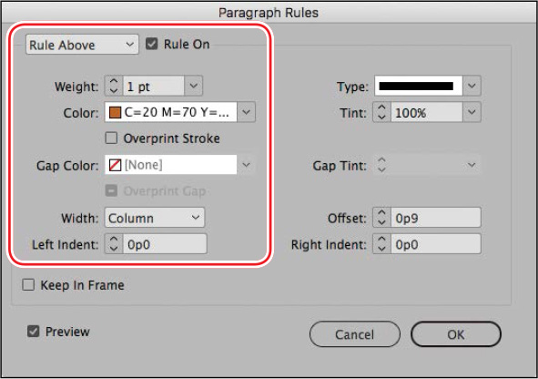
Choose Paragraph Rules from the Paragraph panel menu.
-
At the top of the Paragraph Rules dialog box, choose Rule Above from the menu, and select Rule On to activate the rule.
-
Select the Preview option. Move the dialog box so that you can see the paragraph.
-
In the Paragraph Rules dialog box, set these options:
-
From the Weight menu, choose 1 pt.
-
From the Color menu, choose the brown-colored swatch (C=20 M=70 Y=100 K=8).
-
From the Width menu, choose Column.
-
-
Click OK to apply the changes.
A rule now appears above the author bio.
-
Choose File > Save.
Working with paragraph shading
To call attention to text within a story, you can apply shading to a paragraph. InDesign provides many options for fine-tuning the shading, including the tint of the shading and its offset from the paragraph. To allow enough space above or below a paragraph for shading, apply a Space Before or Space After setting for the paragraph. To quickly and consistently apply shading, you can include paragraph shading in a paragraph style.
Applying shading to a paragraph
First, you will apply shading to the paragraph containing the author’s bio, which is at the end of the story. Later, you will save this effect as part of the paragraph style.
Tip: The paragraph-shading
controls are available in the Control panel as well.
-
Using the Type tool (
), click to place an
insertion point in the author biography at the end of the magazine
article. This targets the paragraph for formatting.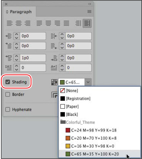
-
Choose Type > Paragraph to display the Paragraph panel.
-
Select Shading in the lower-left corner of the Paragraph panel.
-
To select the color of the shading, click the Shading Color menu to the right of the Shading box. Select the color swatch named C=65 M=35 Y=100 K=20.
-
To fine-tune the shading, choose Paragraph Borders & Shading from the Paragraph panel menu, and click the Shading tab at the top.
Tip: You can also open the
Paragraph Shading dialog box by Alt-clicking (Windows) or
Option-clicking (macOS) the Shading Color button on the Control
panel or Paragraph panel. -
Select the Preview option. Move the dialog box so that you can see the paragraph.
-
Type 50 in the Tint field.
-
In the Offsets area, confirm that the Same Settings icon (
 ) is selected and the Offset is set to 0p6 to
indent the text from the shading.
) is selected and the Offset is set to 0p6 to
indent the text from the shading.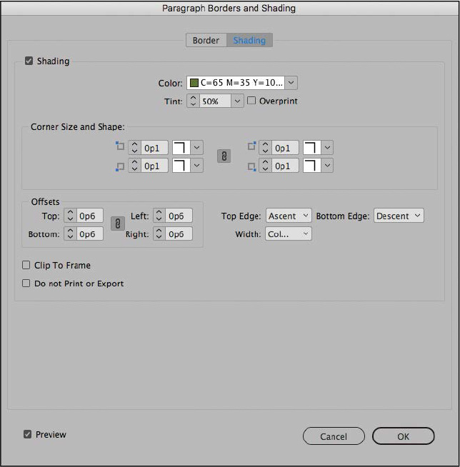
-
Choose Text from the Width field to see how the shading adjusts to the longest line of text. Then, choose Column again.
-
Click OK to apply the changes.
The paragraph is now shaded to match the other tints used on the page.
-
To view your results, choose Presentation from the Screen Mode menu (
 ) in the Application bar at the top of the
screen.
) in the Application bar at the top of the
screen. -
When you’re finished viewing the document, press Esc.
Congratulations, you have finished the lesson. To finalize this article, you would likely spend time with an editor or proofreader to fix any tight or loose lines, awkward line breaks, widows, and orphans.
Exploring on your own
Now that you have learned the basics of formatting text in an InDesign document, you’re ready to apply these skills on your own. Try the following tasks to improve your typographic skills.
-
Place an insertion point in various paragraphs and experiment with turning hyphenation on and off in the Paragraph panel. Select a hyphenated word and choose No Break from the Character panel menu to stop an individual word from hyphenating.
-
Experiment with different hyphenation settings. First, select all the text in the main story. Then, choose Hyphenation from the Paragraph panel menu. In the Hyphenation Settings dialog box, select Preview, and then experiment with the settings. For example, Hyphenate Capitalized Words is selected for this text, but an editor would probably want to turn it off to prevent the chef’s name from hyphenating.
-
Experiment with different justification settings. First, select all the text, and then click Justify With Last Line Aligned Left (
 ) in the Paragraph panel. Choose
Justification from the Paragraph panel menu. In the Justification
dialog box, select Preview and experiment with the settings. For
example, look at the difference that the Adobe Single-Line Composer
and the Adobe Paragraph Composer make when applied to justified
(rather than left-aligned) text.
) in the Paragraph panel. Choose
Justification from the Paragraph panel menu. In the Justification
dialog box, select Preview and experiment with the settings. For
example, look at the difference that the Adobe Single-Line Composer
and the Adobe Paragraph Composer make when applied to justified
(rather than left-aligned) text. -
Choose Type > Insert Special Character and view all the options available, such as Symbols > Bullet Character and Hyphens And Dashes > Em Dash. Using these characters rather than hyphens significantly enhances how professional the typography looks. Choose Type > Insert White Space and notice the Nonbreaking Space. Use this to “glue” two words together so they cannot split at the end of a line (such as “et al.”).