Chapter twelve. Beyond the logo
“The role of the logo is to point, to designate—in as simple a manner as possible.”
Those were Paul Rand’s words in a 1991 article published by AIGA titled “Logos, Flags, and Escutcheons.” I agree. But of course as you should know by this point in the book, the strongest visual identities are about a lot more than a trademark in isolation.
Andrew Sabatier said we should avoid all reference to the word logo: “Logos are only meaningful in context and they should be seen to add value to that context. It is unlikely that a logo alone will be able to add sufficient value to a business. Logos are best employed in a system of brand marks that determine a unique brand experience.”
Whatever you choose to call these marks we love to create, Andrew is right about the value they offer to a new client.
In their book Identify, the partners of Chermayeff & Geismar & Haviv agree on how much worth a newly crafted logo adds to a business: “It is only after a mark is officially adopted that the public will embrace it and with time come to associate it with their feelings about the company or institution it represents. Like a good red wine, a trademark needs to mature.”
Indeed.
The delicious dream
In this final chapter we’ll look at a few examples of how brand identities are strongest when a variety of touchpoints all work together. The first example is by design studio 160over90.
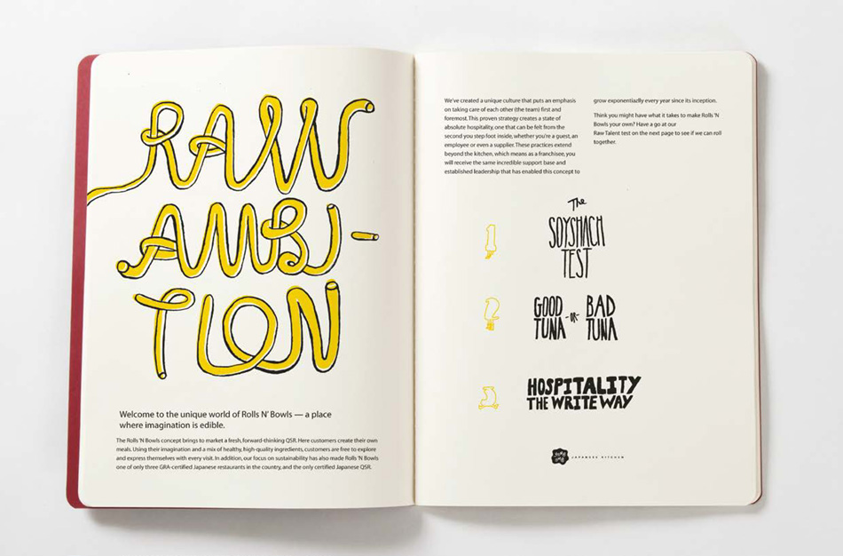
Based out of Gainesville, Florida, Rolls n’ Bowls was a made-to-order Japanese kitchen. (Think Chipotle, but with sushi.) The kitchen was in need of a new identity, one that could accentuate its strengths and propel the company from local stronghold to national franchise. Upon developing an idea that focused on the customers’ ability to create the most unique sushi rolls, salads, and rice bowls, Yume Umē was born.
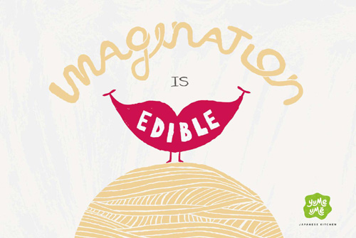
Japanese for “Delicious Dream,” Yume Umē now emphasizes the role of creativity in the dining experience, where “Imagination is Edible.”
Yume Umē
By 160over90
Chief creative officer: Darryl Cilli, executive creative director: Jim Walls, creative director: Stephen Penning, designer: Kelly Dorsey, writer: Kyle Arango
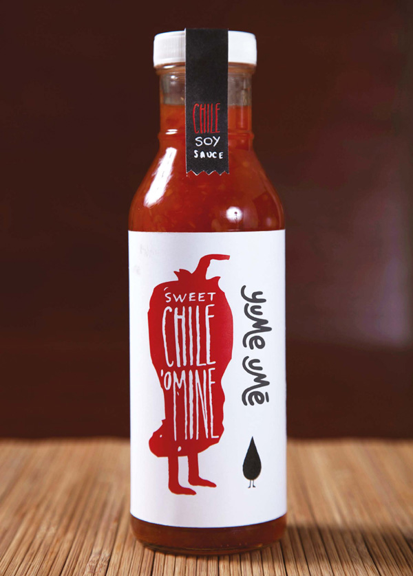
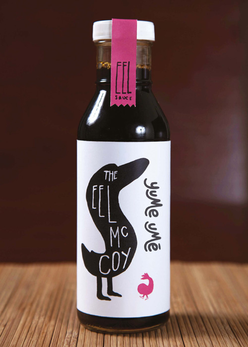
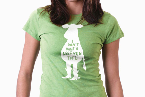
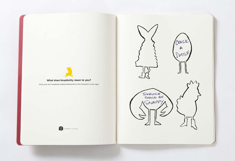
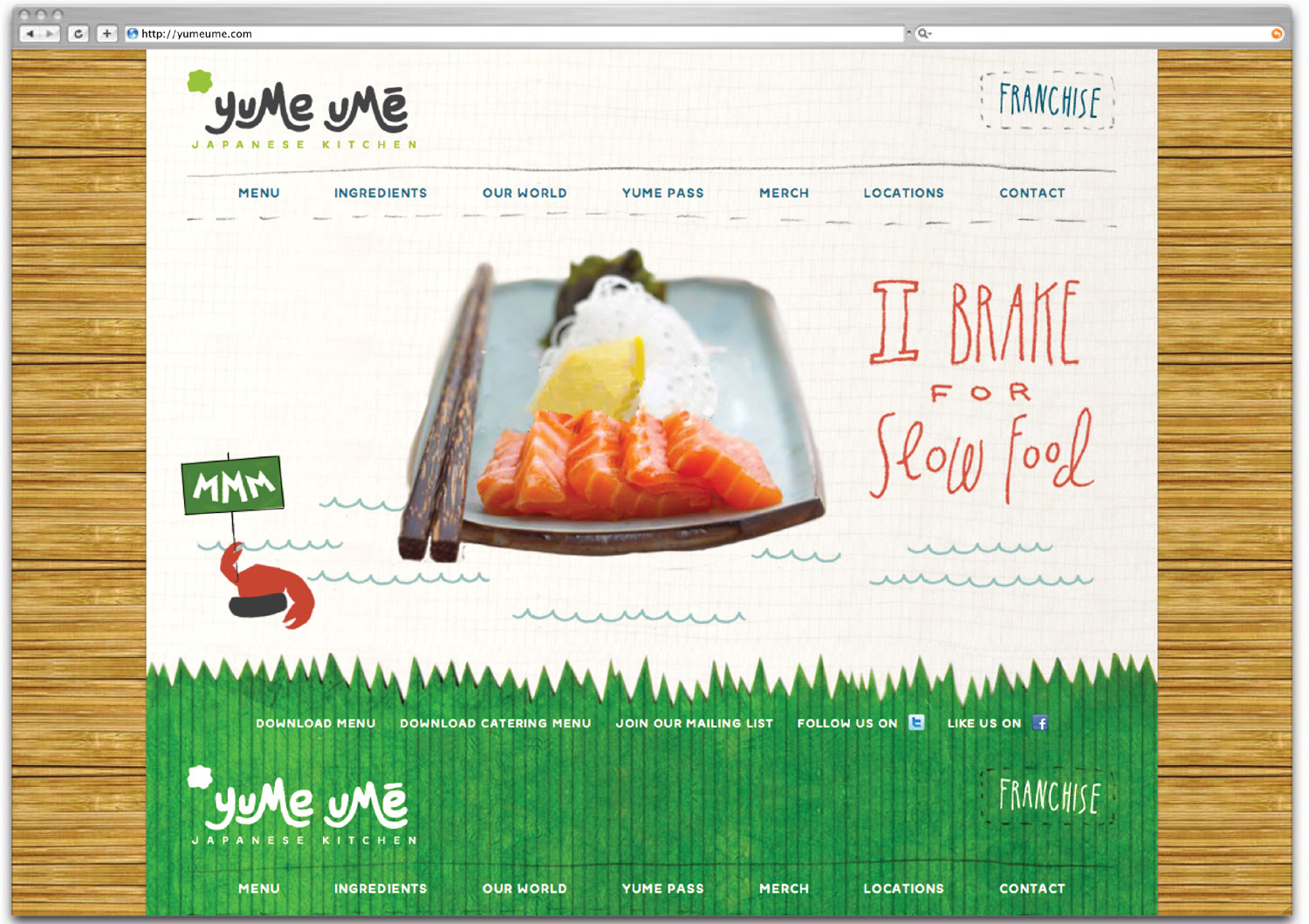
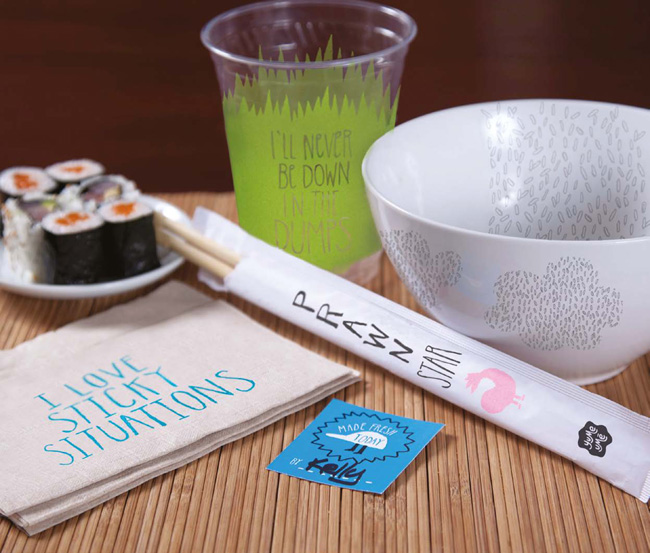
An organic, illustrative approach was used to communicate the sense of imagination, and in addition to the new name, 160over90 created a logo, website, menu, and various campaign pieces.
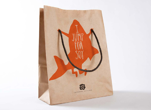
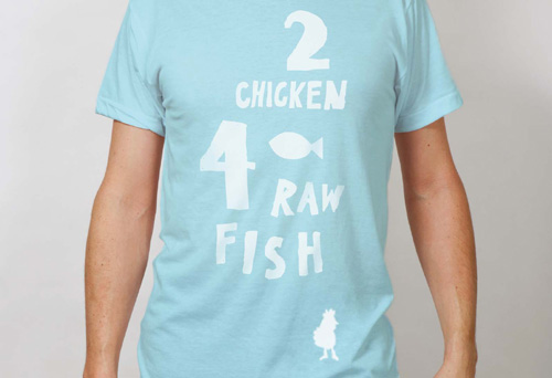
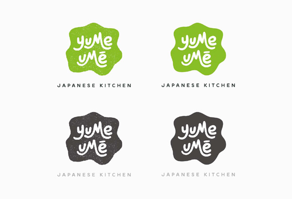
A worthy goal in any identity project is to give your client the ability to remove the logo from marketing material and still have the onlooker identify the brand. That’s what 160over90 achieved here, with a distinctive style of illustration matched with a bright color palette and playful type design.
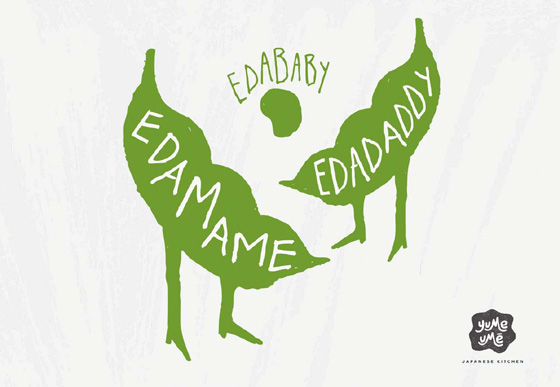
Edamame are unripe soybeans that are steamed in the pod. 160over90 added some wit to the identity with a twist on the ingredient’s name—edamame, edadaddy, edababy.


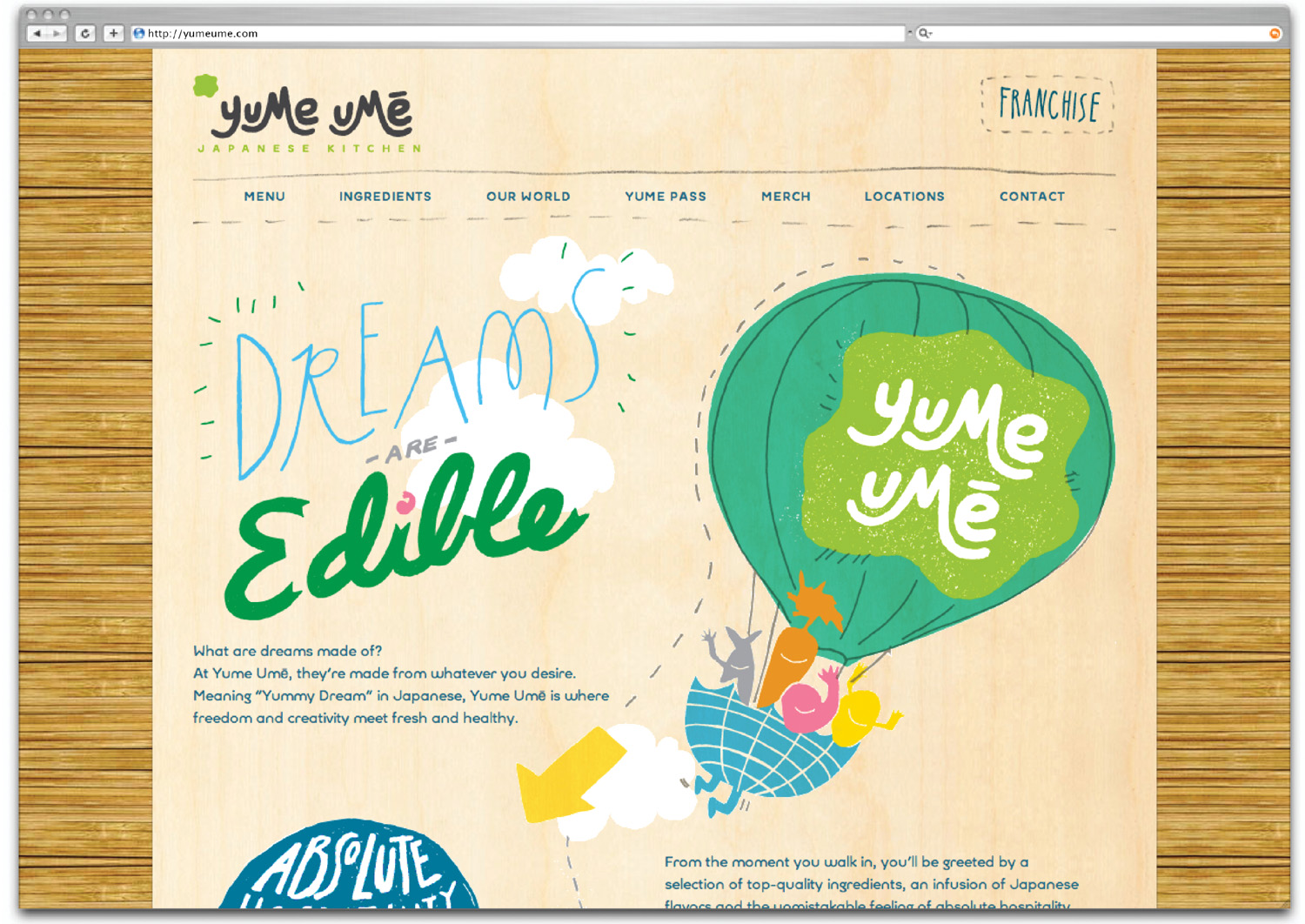
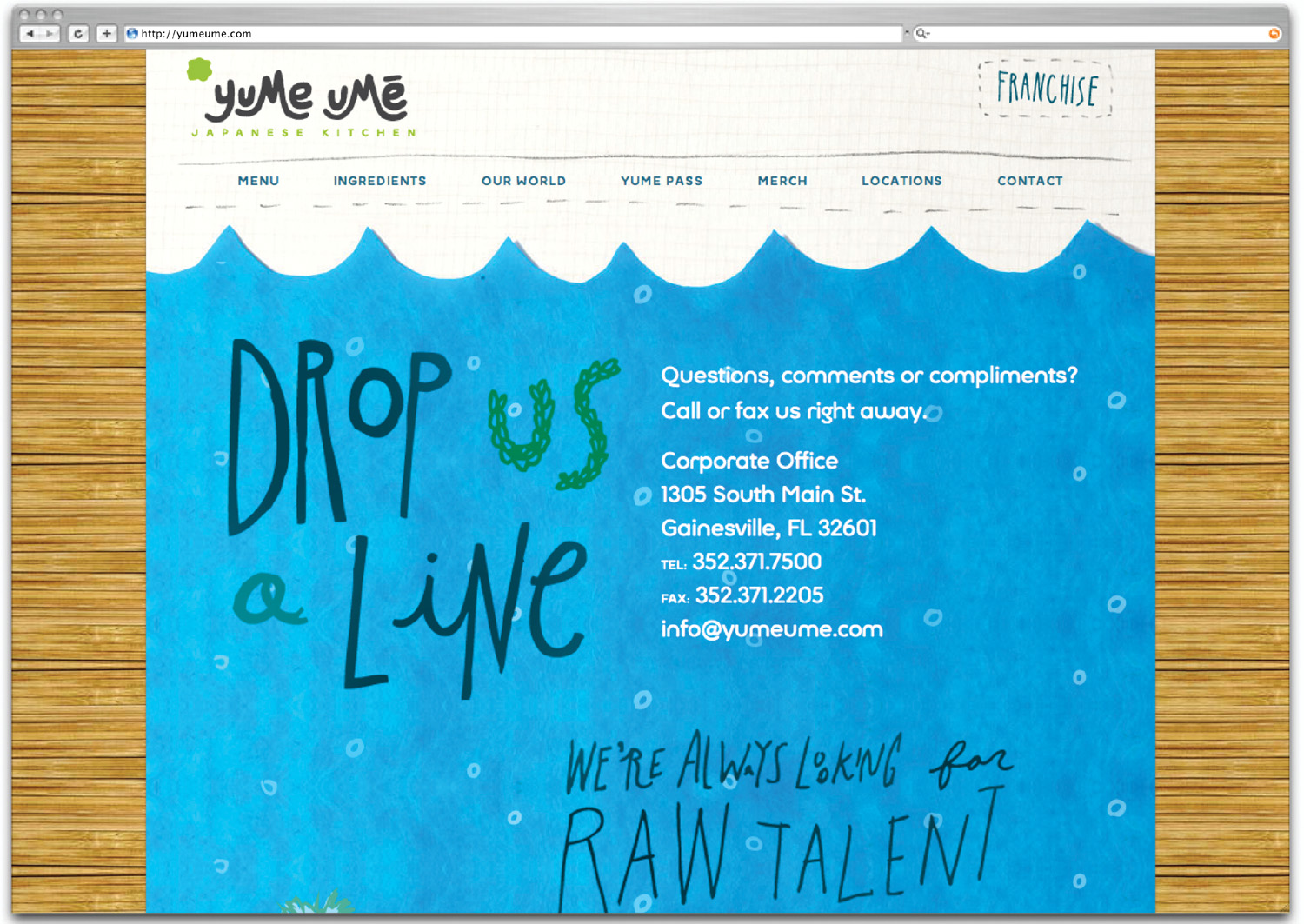
Imagine removing the logo from the top corner of the website. Each web page still contains a cohesive visual appearance, with a range of design elements uniting to form a greater whole.
Cause and effect
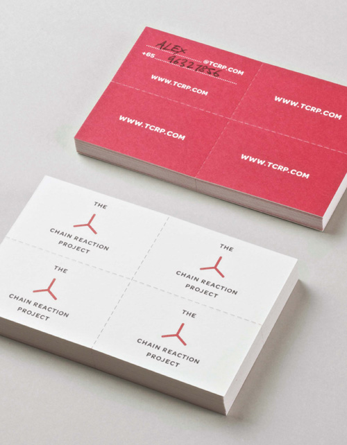
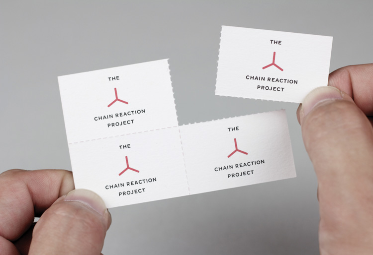
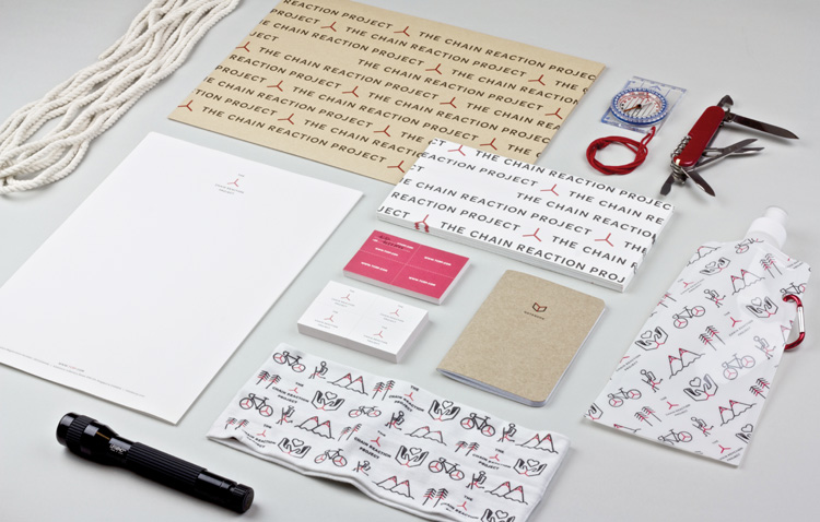
Another successful identity is this example from Singapore-based studio Bravo Company. The designers worked with The Chain Reaction Project (TCRP), a nonprofit organization that was set up to help change lives in some of the world’s least-developed nations. TCRP’s mission is to find a cause and have an effect, and from there grow the initiative by inspiring others to be catalysts for change.
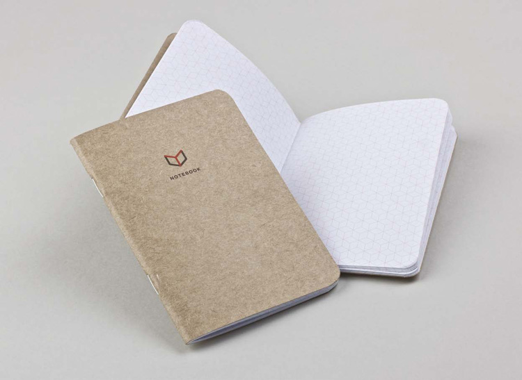
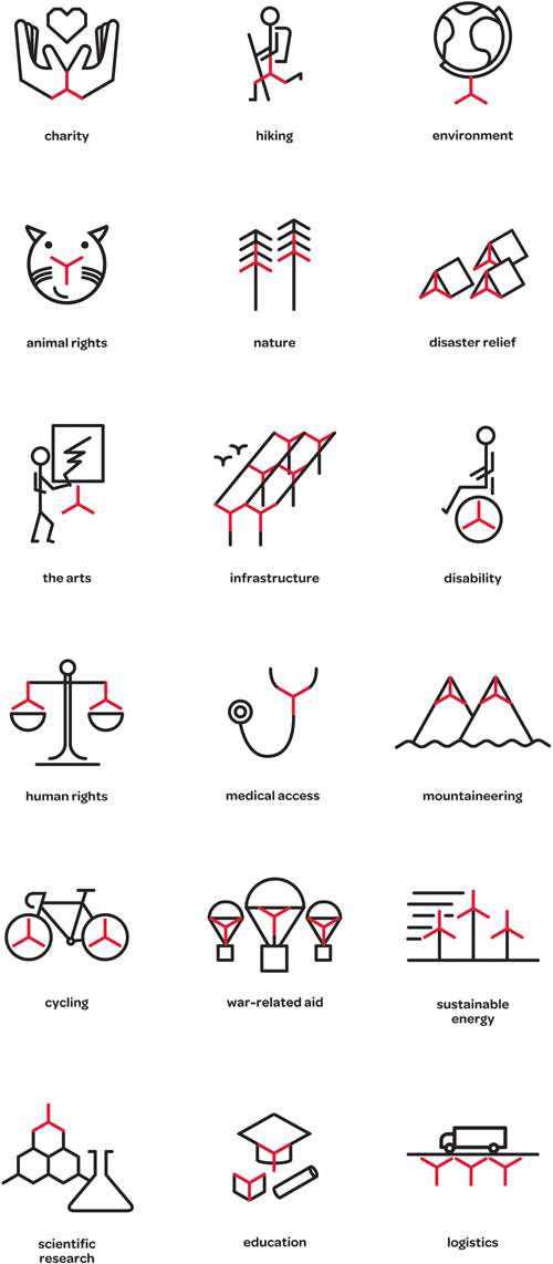
The Chain Reaction Project
By Bravo Company
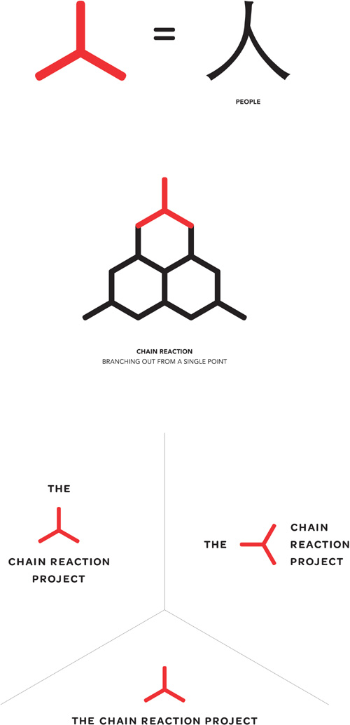
The namecard creates its own chain reaction, cleverly perforated so you can pass it on to other people. Don’t underestimate the tactile nature of print design, where a touch of quality in the paper or card stock can make a notable difference to the impression on recipients.
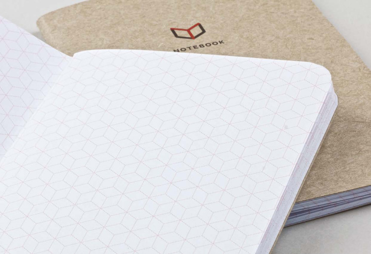
The design is carried through to the blank pages of a notebook, acting as a subtle grid while reinforcing the idea behind the identity.
Iconography highlights the flexible outcome that Bravo Company gave its client.
It’s all in the details
Logos can prove to be much more valuable when they’re less to do with a single mark slapped on a mug, T-shirt, or tote bag, and more to do with being one piece of a collection of elements, a sentiment backed up by Pentagram partner Michael Bierut: “The best work in the area comes down to what most designers would agree on: the obvious thing, it’s not the actual logo but how it is used.”
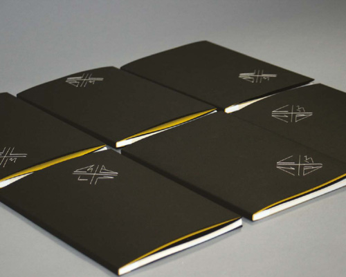
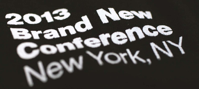
This next identity is by Armin Vit and Bryony Gomez-Palacio of UnderConsideration. The duo create a new identity every 12 months for their annual Brand New Conference (BNC). A logo on its own wouldn’t be anywhere near as effective as the attention to detail that the duo pay to the broader visual identity.
Brand New Conference 2013
By UnderConsideration
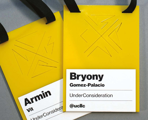
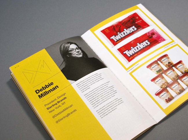
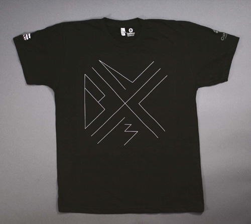
Built around a custom, flexible “BNC13” wordmark and a black-yellow-white color palette, the conference materials surprised even the most weathered conference attendee.
The logo was built on a very restrictive grid, with each vector point snapping precisely 10 pixels apart.
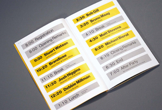
The conference program featured a laser-cut jacket cover showing the pixel grid. All of the 500 programs had a hand-sewn logo in different locations of the cover.
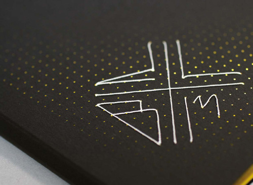
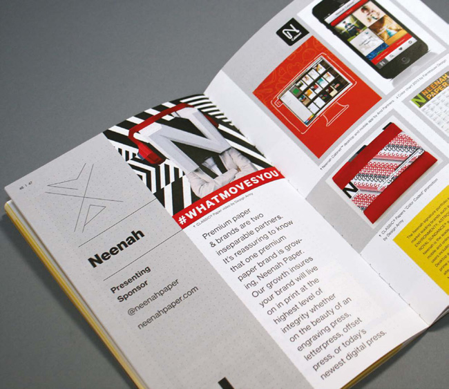
The speakers and sponsors had a custom logo showing their initials.
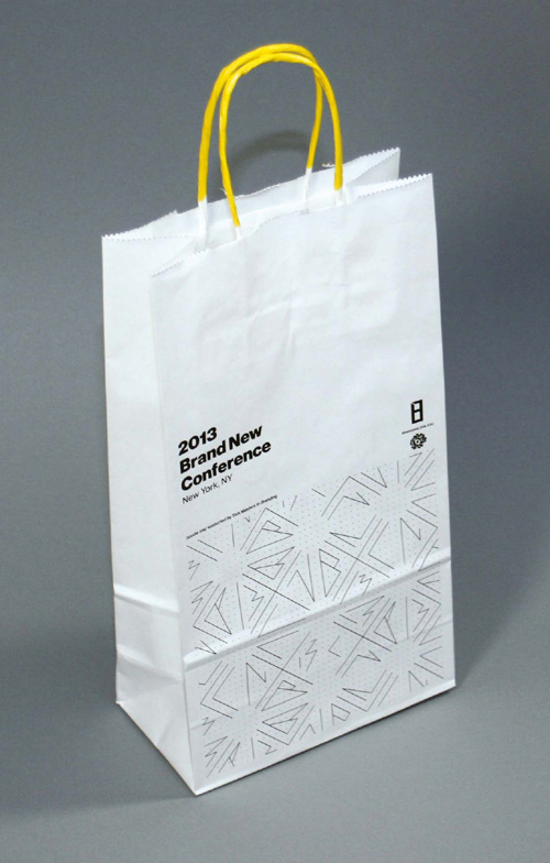
The goodie bags—bought from Uline and silkscreened—were customized by dipping each one individually in yellow paint to have a dash of color in the handles.
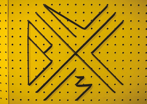
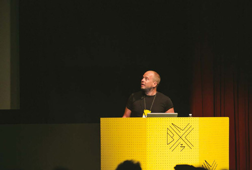
The venue’s podium was covered using store-bought pegboard that was painted yellow and had the BNC logo “sewn” on with climber’s rope.
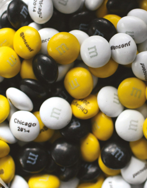
Armin and Bryony even got custom black, yellow, and white M&Ms showing the location of the following year’s conference.
You can’t buy happiness, but you can buy tea
All About Tea is an expert wholesale tea distributor based in Portsmouth, England. It sources its tea from remote regions, to bring the best of the world’s flavors to a global audience. The company’s offerings extend from classic varieties to specialist blends.
All About Tea’s ambition was to tweak its wholesale offering while satisfying the need to reach new audiences. The owner wanted to keep the warehouse feel but also elevate the group slightly to establish a loyal customer base who felt they were getting premium quality at wholesale prices.
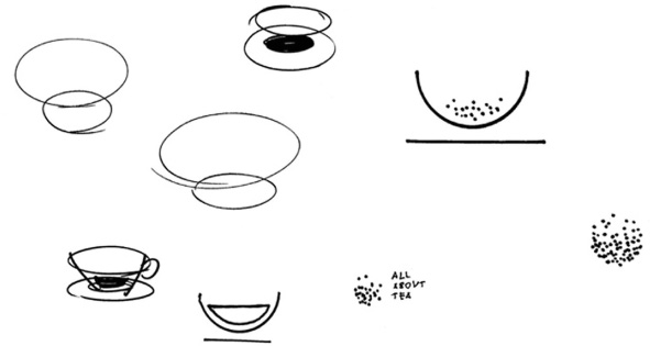
Moving Brands set out to create a new identity that needed to work effectively across All About Tea’s existing wholesale market as well as enable its clientele to grow into retail channels. It was also vital to communicate the founder’s passion for the art and intricacies of tea.
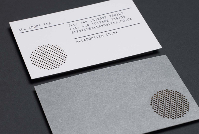
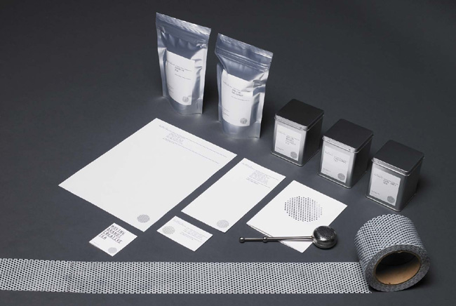
The symbol represents the tea-making process—the blending and the straining. The shape also references a seal or stamp, used to signify quality across the various applications. In all print material the dots in the symbol are laser-cut, inspired by the factory elements and tools involved in the making and distribution of tea.
Orator, a monospaced typeface, was chosen to reflect the uniform spacing of the mark as well as reference the utilitarian infographics associated with import and export. The typeface strengthens the ideas behind the metronomic process of the company’s offer.
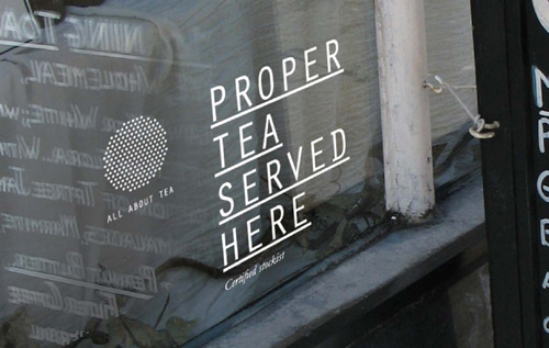
The secondary type, Garamond Italic, is used to represent the founder’s expert voice. This is more fluid and more conversational, and it balances the strength of Orator. It also brings out the quirks and passions of the organization and the people who make it.
The monochrome color palette helped to set All About Tea apart from its competitors in a market dominated by browns and greens.
The full Moving Brands system incorporated a brand identity, brand architecture, guidelines, tone of voice, website, packaging, stationery, photography style, presentation and sales templates, and mood film.
Beneath the waterline
Michael Johnson of johnson banks shared the analogy of an iceberg to explain how what we create is about a lot more than a logo on its own. “There’s this bit above the waterline, and then there’s a huge bit under the water. I used to use this analogy when I was trying to explain to clients that, yes, you stick a flag on the iceberg so that you can see it, and the logo or the symbol is like that flag sticking out above the water. But I’m really aware of the fact that under the water there’s this massive great bit of ice that’s full of all sorts of applications, all kinds of areas of the brand that still need to be designed.”
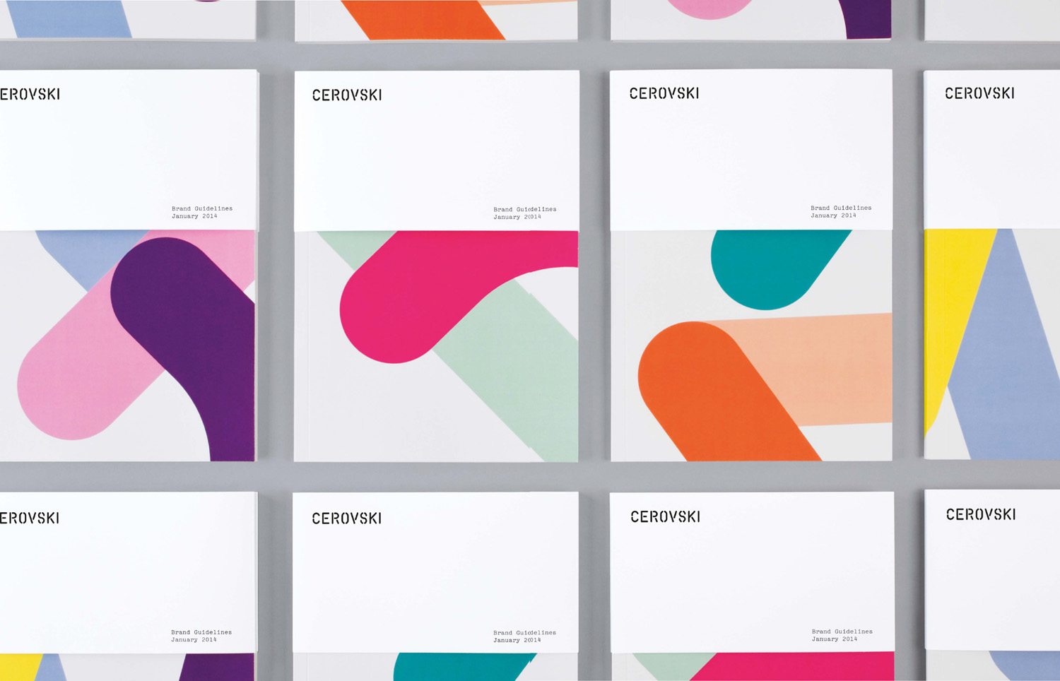
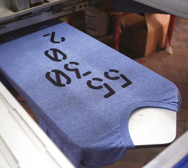
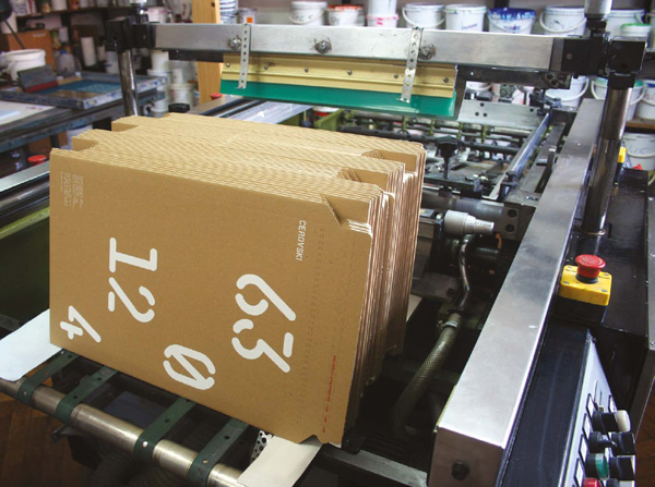
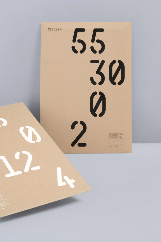
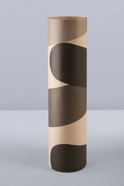
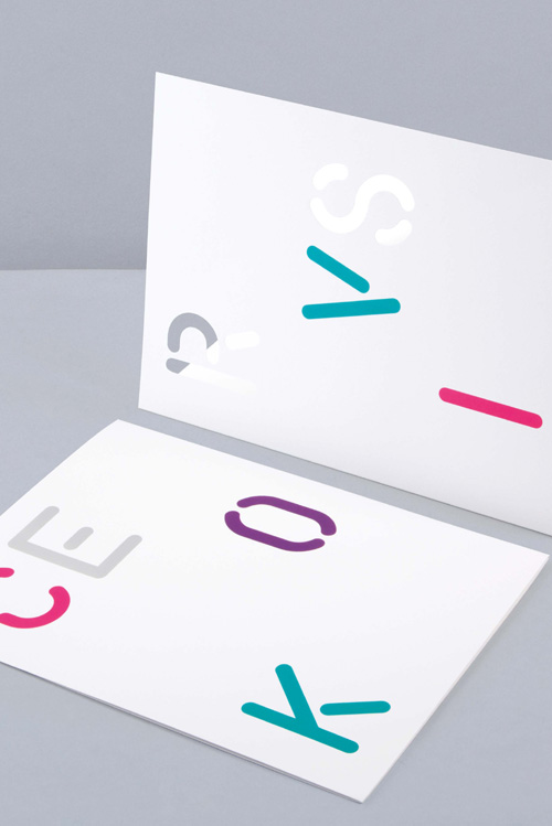
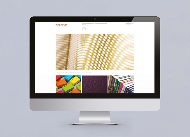
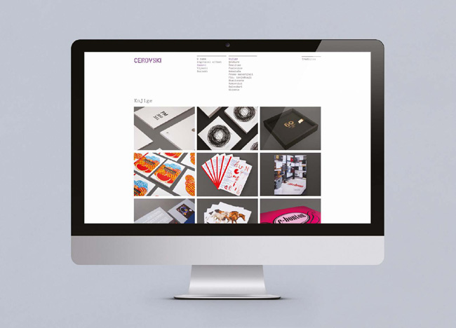
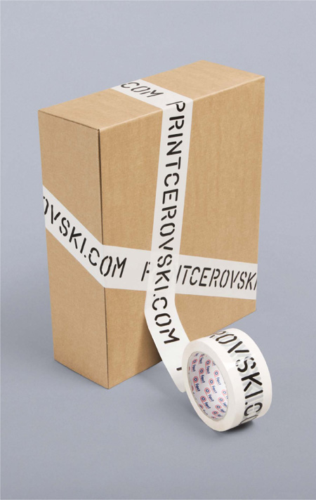
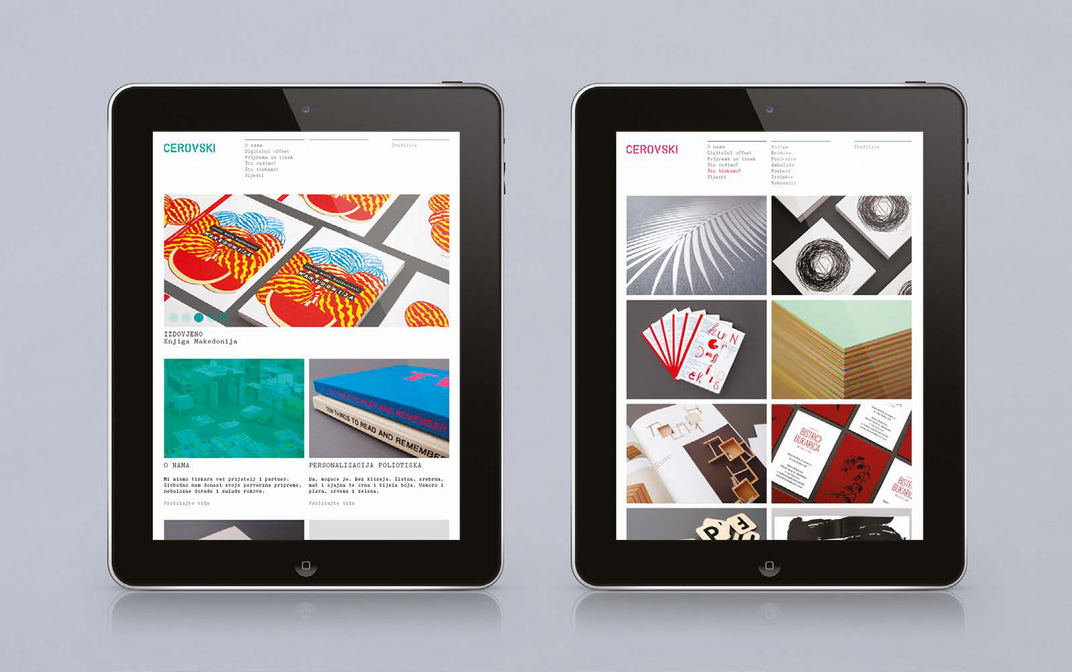
Rounding off the book is this final example by Bunch, designed for Cerovski, a Croatian print production studio.
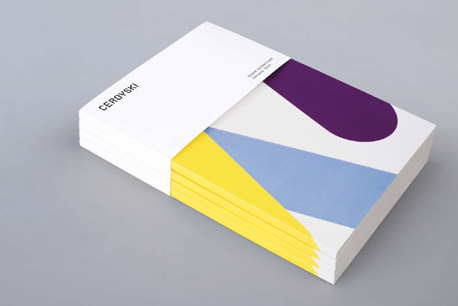
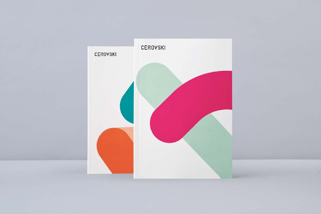
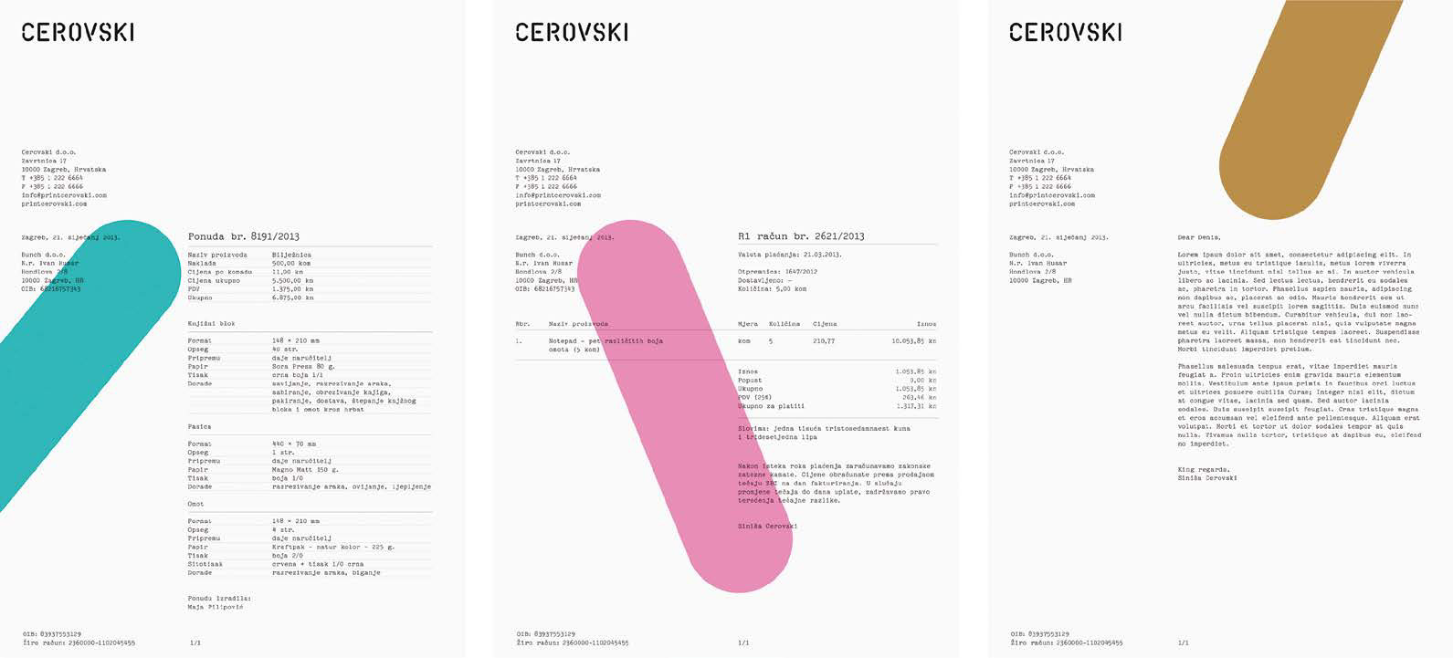
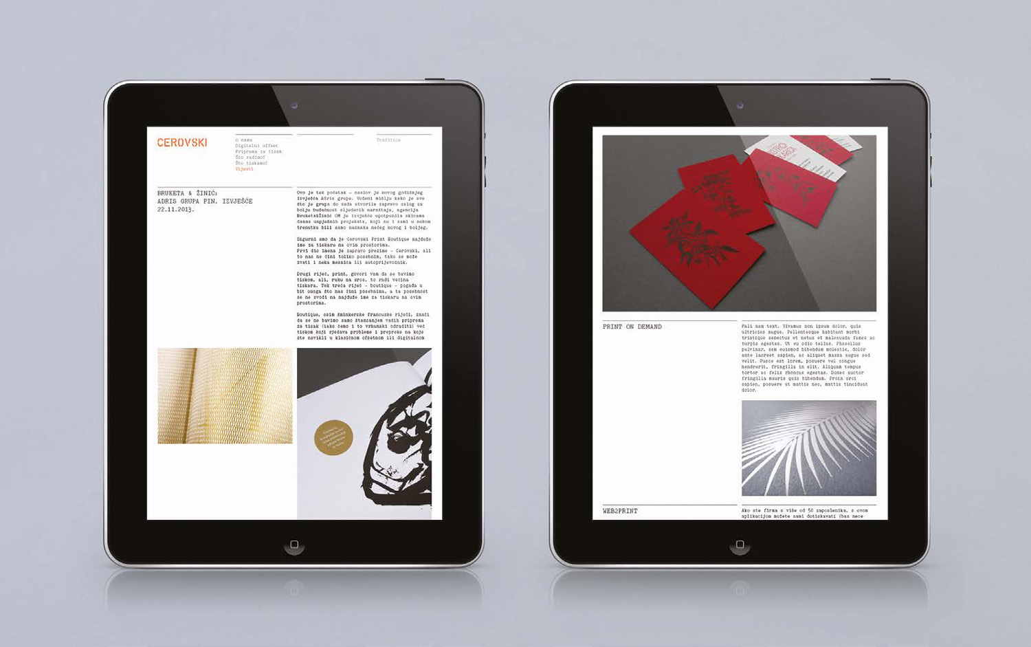
Cerovski revels in the challenge of “nebulous finishing, microscopic editions, absurd materials and crazy deadlines,” and thanks to the designers at Bunch, it has an appropriate, distinctive identity that’s much more memorable than a single logo.
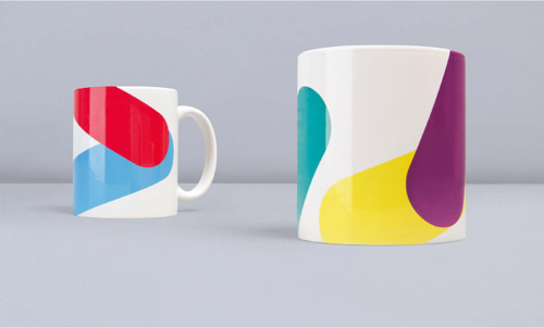
The wordmark is well crafted, but its role is limited in what it can do for the brand. Bunch understood this and designed the mark in a way that allowed it to be broken into individual parts, creating greater flexibility in the overall design approach and giving the client something infinitely more useful than a logo in isolation.

A single mark that sums up a company in a very basic way can eventually hold a lot of equity. But if what we design is to really add interest to a company’s visual appearance, there’s no denying the value of what’s beneath that waterline.
