Chapter one. We’re surrounded
Logos bombard us. Think clothes labels, running shoes, TVs, and computers. From the moment we wake to the moment we sleep, they’re an ever-present part of our daily routine.
The average American sees 16,000 advertisements, logos, and labels in a day, said Dharma Singh Khalsa, M.D., in his book Brain Longevity.1
1 Dharma Singh Khalsa, M.D. with Cameron Stauth. Brain Longevity: The Breakthrough Medical Program That Improves Your Mind and Memory. (New York: Grand Central Publishing, 1999.)
Don’t believe it?
To illustrate the constant presence of logos in our lives, I spent the first few minutes of a typical working day photographing logos on the products I interact with, beginning with my morning alarm.
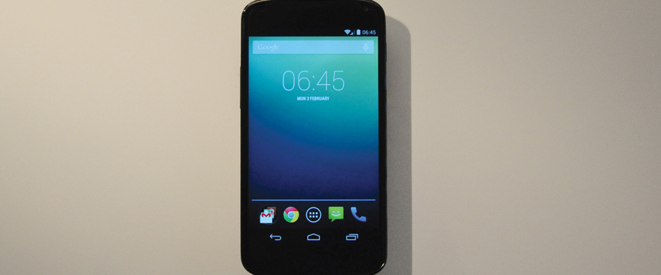
As I reach over to swipe off the alarm, there in front of me is the Google wordmark and the Chrome symbol. They’re basically the first things I see after waking, even if I’m not paying much attention.
And so it begins.
The rest of the sequence tells its own little story, giving a very brief glimpse into my morning routine, which isn’t to say that there weren’t plenty of other logos around at the time—on book spines and magazines, kitchen appliances, other food products, toiletries, and labels on my clothes.
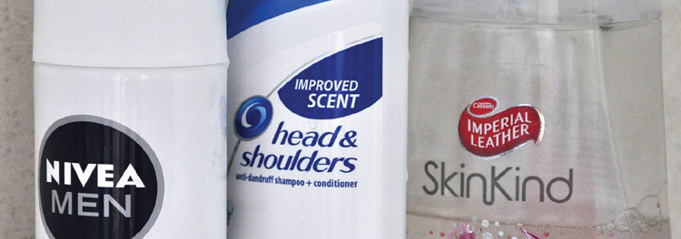
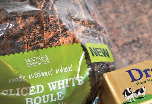
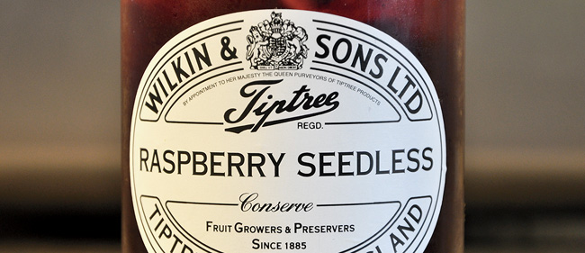
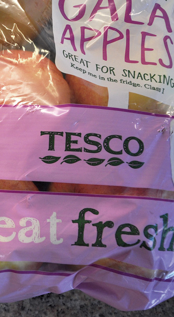


Try it yourself—maybe not as soon as you wake up. But what about now? Look around. How many logos can you see?
According to SINTEF, the largest independent research organization in Scandinavia, in 2013 a full 90 percent of the data in the world had been generated during the previous two years.2 Because humanity is now producing such a vast amount of information, much of it visually branded, we’re seeing logos that are increasingly similar to one another. This poses a problem for companies that are trying to differentiate themselves visually, but it also creates an opportunity for designers who are skilled enough to create iconic designs that stand above the crowd.
2 ScienceDaily, May 22, 2013, www.sciencedaily.com/releases/2013/05/130522085217.htm
The Guild of Food Writers
By 300million, 2005

Take, for instance, 300million, which was one of the United Kingdom’s top creative studios before closing its doors in 2012. The team spent two weeks in 2005 creating and crafting this logo for The Guild of Food Writers, making great use of negative space to show a spoon inside a pen nib.
“What you take away is just as important as what you keep,” said Katie Morgan, who was senior designer at 300million.
Seeing just one imaginative design like this is a testament to the work of top studios similar to the 300millions of old, as well as ideal inspiration for designers everywhere who continually strive to produce excellent work. Let’s look at a few more in Chapter 2.
